
Workplace and Digital Printing Solutions
Confidence is 0 to 1 — a low score is reported, never hidden. Set a floor in your own code and fall back to your defaults below it, rather than shipping the raw score as certainty.
The kit
Brand colours
Click a colour to copy its hex.
Fonts
- Headline case
- none
- Headline tracking
- normal
- Headline weight
- bold
Logo
The logo features the iconic red 'Xerox' wordmark alongside a spherical red icon marked with a white stylized 'X' ribbon design.
Sampled from the mark
- Source
- inline-svg
- Lightness
- 0.16
- Transparent
- yes
The page we read
The capture every value above was read from. Its top, at readable scale.
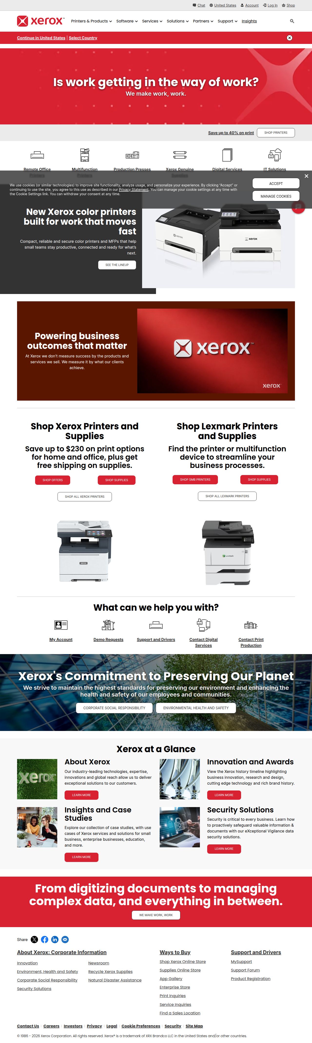
The read
The company
Positioning
Xerox exists to help organizations streamline operations through modern workplace solutions, document management, and digital printing technologies. Designed for enterprises, remote offices, and commercial printing environments, Xerox connects physical and digital workflows to eliminate operational friction. By combining reliable hardware with intelligent print management, they enable businesses to focus on core productivity rather than modern administrative overhead.
Who it is for
Enterprise procurement teams, IT managers, remote workforce directors, and commercial printing operations.
Values
Workplace ProductivityDigital IntegrationReliabilitySustainabilityLook and feel
Pill corners, balanced layout, gradients, corporate, professional.
Reads as
corporateprofessionalenterprisecrispstructuredRecurring motifs
red hero grid background with subtle geometric dot overlaypill-shaped call-to-action buttons- Theme
- light
- Corners
- pill
- Density
- balanced
- Borders
- solid
- Shadows
- subtle
- Gradients
- yes
- Icons
- outlined
- Illustration
- none
- Photography
- full-color
- Imagery shows
- office multifunction printers, enterprise hardware, corporate environments, technology imagery
- Imagery composition
- isolated product shots on neutral background, centered framing, crisp studio lighting
- Imagery grading
- bright, natural, neutral tone with strong accent lighting on products
Voice
The voice reads Professional, Direct, Solution-oriented, Empathetic.
Tone
ProfessionalDirectSolution-orientedEmpatheticVoice
AuthoritativePragmaticClearHelpfulWords it uses
Workplace solutionsDigital printing technologiesDocument managementRecycle Xerox suppliesWords it avoids
PaperworkLegacy printingOutdated officeComplex setup- Calls to action
- Action-oriented and functional, focusing on discovery, support, and utility (e.g., 'Find a Printer', 'Check Your Order Status', 'Recycle Xerox Supplies').
- Headline case
- sentence
- hero headline
- Empathetic, problem-focused, and slightly conversational ('Is work getting in the way of work?')
- navigation and utility
- Direct, clear, and product-focused ('All Printers', 'Technical Assistance')
The recordwhat we measured, and how sure we are
How the brand reads
Xerox delivers workplace document technologies, managed print services, and high-volume digital printing solutions for businesses and remote teams.
Known for
Office copiers and printersDigital sheet-fed printing pressesDocument workflow softwareToner and supply recycling programsDesign personality
Clean, highly functional, and corporate, utilizing a light-mode layout dominated by clean off-white canvas and grounded by signature red accent colors.
Design conventions
Structured product-grid navigationClear categorizations for hardware vs suppliesUtility-first top navigation bar for support and recyclingHigh-contrast red accents against neutral grey backgroundsWriting style
Problem-first hero statements paired with practical, straightforward navigation and product descriptions.
Audience, inferred
IT administrators, enterprise office managers, procurement officers, and digital print professionals.
Values, inferred
ProductivityOperational EfficiencySustainabilitySupportabilityApplying the brand
Adhere to a crisp light-mode theme using off-white (#F8F9F9) as the primary slide canvas, charcoal (#39393A) for body text, and Xerox corporate red (#D82231) sparingly as a focal accent for key metrics or CTAs. Avoid dark-themed slides, and rely on clear corporate typography with strong structural hierarchy.
Spacing and accessibility
- Base unit
- 8px
- Scale
- 0.5 · 1 · 2 · 3 · 4 · 6 · 8
- Content margin
- 24px
- Contrast target
- AAA
- Minimum font size
- 16px
- Colourblind safe
- yes
How this was read
- Platform
- Generic
- Overall confidence
- 0.63
- Font confidence
- 1.00
- Schema version
- v2
The score was built from
Logo not foundPrimary color extractedSecondary color extractedFonts found: Poppins, Roboto CondensedCompany name found: Workplace and Digital Printing SolutionsConfidence is 0 to 1 — a low score is reported, never hidden. Set a floor in your own code and fall back to your defaults below it, rather than shipping the raw score as certainty.
Read something wrong? Sample it again — this page follows within 15 minutes.
Confidence per field · 23 fields
- description
- 0.00
- industry
- 0.00
- motion
- 0.00
- tagline
- 0.00
- accessibility.contrast_target
- 0.85
- audience
- 0.85
- background
- 0.85
- brand_intelligence
- 0.85
- contrast
- 0.85
- copywriting
- 0.85
- font_availability
- 0.85
- fonts
- 0.85
- logo_description
- 0.85
- name
- 0.85
- palette
- 0.85
- positioning_statement
- 0.85
- primary
- 0.85
- secondary
- 0.85
- text
- 0.85
- tone
- 0.85
- values
- 0.85
- visual_style
- 0.85
- voice
- 0.85
Get this as JSON
GET /v1/brands/xerox.com
curl https://api.extractbrand.dev/v1/brands/xerox.com \
-H "Authorization: Bearer YOUR_API_KEY"Sampled from xerox.com on . Own this brand? Claim it or report this page.