
Massachusetts Institute of Technology
Confidence is 0 to 1 — a low score is reported, never hidden. Set a floor in your own code and fall back to your defaults below it, rather than shipping the raw score as certainty.
The kit
Brand colours
Click a colour to copy its hex.
Fonts
- Headline case
- none
- Headline tracking
- tight
- Headline weight
- bold
Logo
The classic MIT logo, consisting of geometric vertical block bars spelling out 'MIT' alongside the text 'Massachusetts Institute of Technology'.
- Source
- header-img
- Transparent
- no
The page we read
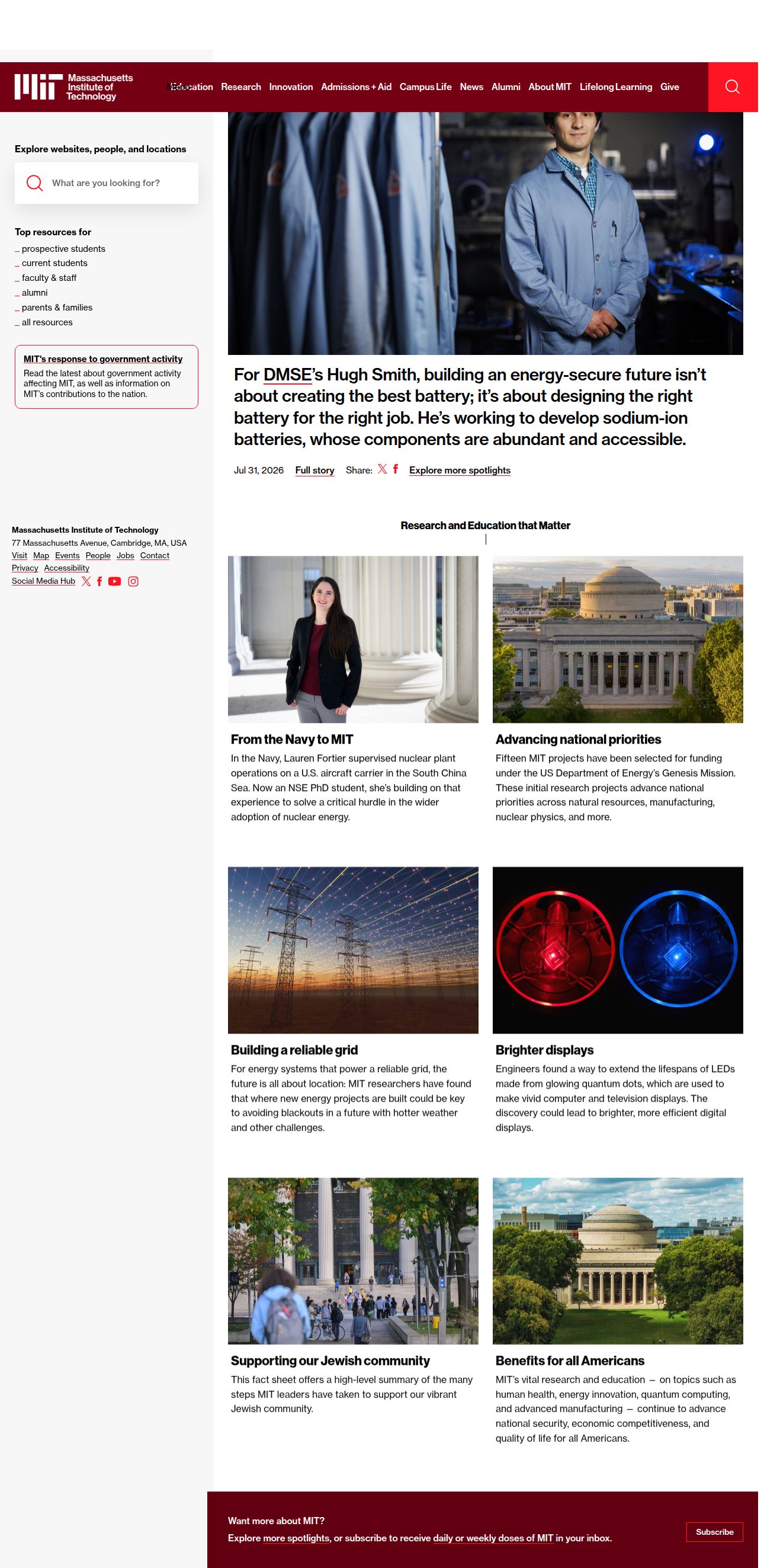
The capture every value above was read from. Its top, at readable scale.
The read
The company
Positioning
The Massachusetts Institute of Technology advances knowledge and educates students in science, technology, and other areas of scholarship to best serve the nation and the world in the 21st century. Through cutting-edge research, hands-on innovation, and academic rigor, MIT fosters a culture of collaborative problem-solving. It empowers a global community of scholars, researchers, and changemakers to address society's most critical challenges.
Who it is for
Prospective and current students, academic researchers, faculty, alumni, global partners, and donors.
Values
RigorInnovationImpactServiceCollaborationLook and feel
Sharp corners, balanced layout, academic, editorial.
Reads as
academiceditorialcleanstructuredauthoritativeRecurring motifs
thin red border accentsleft-hand sidebar navigation listunderscore list prefixes- Theme
- light
- Corners
- sharp
- Density
- balanced
- Borders
- solid
- Shadows
- none
- Gradients
- no
- Icons
- outlined
- Illustration
- none
- Photography
- full-color
- Imagery shows
- researchers in laboratories, campus architecture, power grid infrastructure, optical technology, students walking on campus
- Imagery composition
- rectangular grid framing, environmental portraits, eye-level architectural shots
- Imagery grading
- natural, realistic color with strong contrast
Motion
Subtle, deliberate reveals where spotlight content blocks and headers fade and shift upward into place upon loading.
Signature effects
700ms headline fade-and-rise transform1000ms content block fade-up transition on loadhover transitions on interactive elements- Intensity
- subtle
- Speed
- moderate
- Easing
- Smooth cubic-bezier and standard ease curves
- Scroll animations
- no
- Hover effects
- yes
- Honours reduced motion
- no
Voice
The voice reads Academic, Authoritative, Impactful, Direct.
Tone
AcademicAuthoritativeImpactfulDirectVoice
PrestigiousVisionaryObjectivePurposefulWords it uses
ResearchInnovationEducationAdmissionsImpactCampus LifeLifelong LearningWords it avoids
CheapEasyDisruptiveGimmick- Calls to action
- Direct, functional label-style navigation and action prompts (e.g., 'Admissions + Aid', 'Give').
- Headline case
- title
- hero headline
- Clear, iconic, and authoritative institution name
- navigation
- Functional, concise, and structured category labels
- spotlight content
- Narrative, outcome-focused, and impact-oriented
The recordwhat we measured, and how sure we are
How the brand reads
The Massachusetts Institute of Technology (MIT) is a world-renowned university focused on scientific and technological research, education, and innovation.
Known for
World-class STEM educationBreakthrough scientific researchTechnological innovationGlobal academic leadershipDesign personality
Clean, authoritative, and academic light-mode layout structured around prominent editorial white space and bold institutional red accents.
Design conventions
Editorial high-contrast light layoutTop-level navigation grouped by academic pillarsGrid-based spotlight story blocksDistinctive institutional accent red against light grey canvasesWriting style
Clear, headline-first storytelling focused on tangible research breakthroughs, institutional impact, and educational access.
Audience, inferred
Students, researchers, academics, global innovators, and institutional supporters.
Values, inferred
RigorInnovationImpactServiceCollaborationApplying the brand
Use a clean light-mode layout dominated by #FAFAFA light grey and crisp white, paired with dark neutral text (#08080B). Apply MIT red (#610210 / #730110) strictly as an accent for key headers, focal callouts, or primary metrics to preserve institutional authority. Maintain clean grid alignment and generous margins.
Spacing and accessibility
- Base unit
- 8px
- Scale
- 0.5 · 1 · 2 · 3 · 4 · 6 · 8
- Content margin
- 24px
- Contrast target
- AAA
- Minimum font size
- 16px
- Colourblind safe
- yes
How this was read
- Platform
- Generic
- Overall confidence
- 0.74
- Font confidence
- 0.50
- Schema version
- v2
The score was built from
Logo found (header-img)Primary color extractedSecondary color extractedFonts found: neue haas grotesk textCompany name found: Massachusetts Institute of TechnologyNothing could fill
font_availabilityConfidence is 0 to 1 — a low score is reported, never hidden. Set a floor in your own code and fall back to your defaults below it, rather than shipping the raw score as certainty.
Read something wrong? Sample it again — this page follows within 15 minutes.
Confidence per field · 23 fields
- description
- 0.00
- industry
- 0.00
- tagline
- 0.00
- font_availability
- 0.30
- accessibility.contrast_target
- 0.85
- audience
- 0.85
- background
- 0.85
- brand_intelligence
- 0.85
- contrast
- 0.85
- copywriting
- 0.85
- fonts
- 0.85
- logo_description
- 0.85
- motion
- 0.85
- name
- 0.85
- palette
- 0.85
- positioning_statement
- 0.85
- primary
- 0.85
- secondary
- 0.85
- text
- 0.85
- tone
- 0.85
- values
- 0.85
- visual_style
- 0.85
- voice
- 0.85
Get this as JSON
GET /v1/brands/web.mit.edu
curl https://api.extractbrand.dev/v1/brands/web.mit.edu \
-H "Authorization: Bearer YOUR_API_KEY"Sampled from web.mit.edu on . Own this brand? Claim it or report this page.