
Oki Doki Digital
Confidence is 0 to 1 — a low score is reported, never hidden. Set a floor in your own code and fall back to your defaults below it, rather than shipping the raw score as certainty.
The kit
Brand colours
Click a colour to copy its hex.
Fonts
- Headline case
- none
- Headline tracking
- normal
- Headline weight
- semibold
Logo
A stylized typographic logo featuring the word 'OKIDOKI' enclosed in a rounded rectangular outline, with diacritic macron marks over the letters 'O'.
Sampled from the mark
- Source
- inline-svg
- Lightness
- 1.00
- Transparent
- yes
The page we read
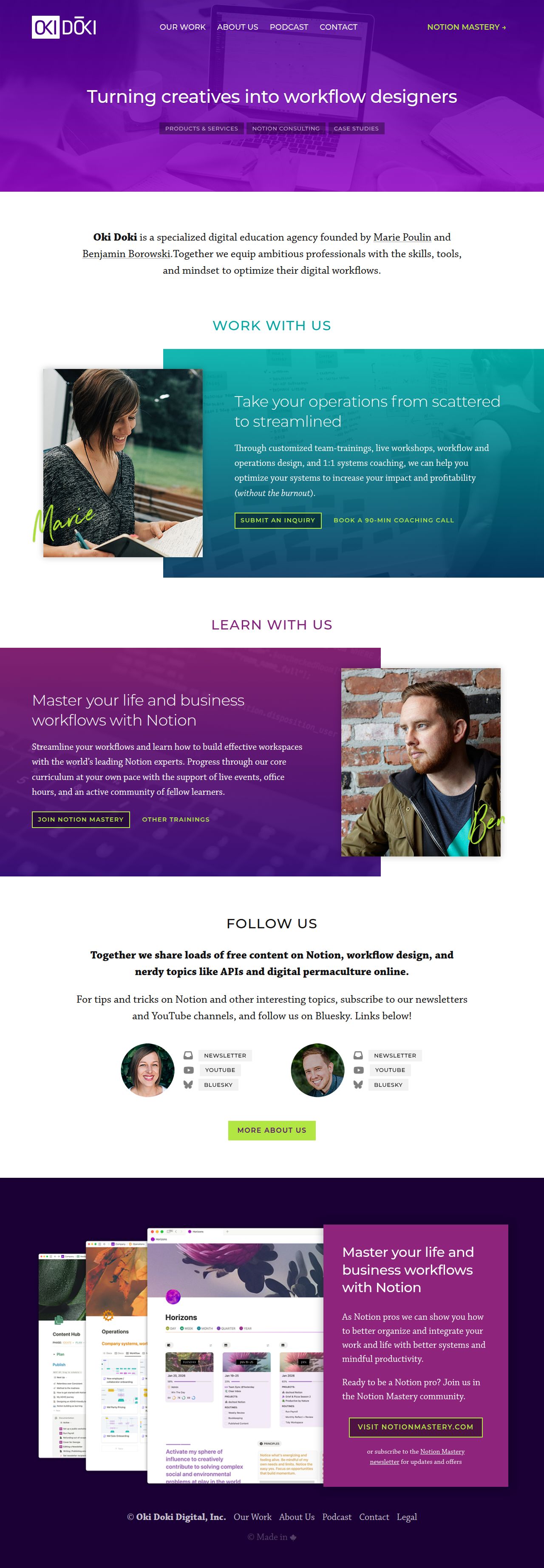
The capture every value above was read from. Its top, at readable scale.
The read
The company
Positioning
Oki Doki Digital exists to equip ambitious professionals and creatives with the skills, tools, and mindset required to optimize their digital workflows. They empower creative individuals to transition into system-minded workflow designers. Through specialized products, case studies, and training programs like Notion Mastery, Oki Doki delivers practical digital transformation for modern knowledge workers.
Who it is for
Ambitious professionals, digital creators, knowledge workers, and teams seeking to streamline their productivity tools and Notion systems.
Values
Workflow OptimizationCreative EmpowermentDigital MasterySystemic EfficiencyLook and feel
Sharp corners, balanced layout, gradients, vibrant, professional.
Reads as
vibrantprofessionalmodernenergeticstructuredRecurring motifs
Overlapping card containershandwritten signature overlays on photosrounded pill tags for taxonomy- Theme
- dark
- Corners
- sharp
- Density
- balanced
- Borders
- solid
- Shadows
- subtle
- Gradients
- yes
- Icons
- filled
- Illustration
- none
- Photography
- full-color
- Imagery shows
- Headshots of founders Marie and Ben, along with UI product mockups and workflow diagrams.
- Imagery composition
- Off-center portraits with overlapping offset color panels and handwritten script overlays.
- Imagery grading
- Warm, natural light portraits contrasted against cool and saturated gradient backgrounds.
Motion
Slightly playful and responsive interactions feature snappy, spring-like hover responses across navigation links and cards.
Signature effects
hover state lifts and transitions on interactive elementsmicro-interactions on call-to-action buttons- Intensity
- subtle
- Speed
- fast
- Easing
- snappy spring ease-out curves
- Scroll animations
- no
- Hover effects
- yes
- Honours reduced motion
- no
Voice
The voice reads Empowering, Practical, Modern, Action-oriented.
Tone
EmpoweringPracticalModernAction-orientedVoice
InstructiveEncouragingAuthoritativeStructuredWords it uses
workflow designersoptimizeNotion Masteryskills and mindsetdigital workflowsWords it avoids
clutteredmanual effortdisorganizedlegacy processes- Calls to action
- Direct, task-focused call-to-actions pointing toward specific products or mastery courses (e.g. 'Notion Mastery →').
- Headline case
- sentence
- hero headline
- Transformational and bold
- navigation CTA
- Direct and product-focused
The recordwhat we measured, and how sure we are
How the brand reads
Oki Doki Digital helps creative professionals and teams design efficient digital workflows and master tools like Notion.
Known for
Notion MasteryWorkflow design for creativesDigital productivity trainingDesign personality
Vibrant, light-mode layout grounded in clean off-white backgrounds with rich purple, teal, and electric lime accents.
Design conventions
Light background palette with high-contrast colored calloutsDirect arrow-driven call-to-action buttonsClear service and product categorization in top navigationWriting style
Short, active statements focused on skill transformation and actionable mastery, using empowering verbs like 'turning' and 'masteryours 'optimize'.
Audience, inferred
Ambitious creative professionals, freelancers, and modern digital teams looking to elevate their productivity systems.
Values, inferred
Workflow OptimizationCreative EmpowermentDigital MasterySystemic EfficiencyApplying the brand
Use a clean light background (#FEFEFE) as the primary slide surface. Apply bold deep purple (#1C0136 or #4A1678) for high-impact header blocks and text, with vibrant lime green (#B2E743) or teal (#17A1A3) for primary action callouts and key highlights. Maintain crisp typography with high visual hierarchy.
Spacing and accessibility
- Base unit
- 8px
- Scale
- 0.5 · 1 · 2 · 3 · 4 · 6 · 8
- Content margin
- 24px
- Contrast target
- AAA
- Minimum font size
- 16px
- Colourblind safe
- yes
How this was read
- Platform
- Generic
- Overall confidence
- 0.63
- Font confidence
- 1.00
- Schema version
- v2
The score was built from
Logo not foundPrimary color extractedSecondary color extractedFonts found: montserrat, chaparral proCompany name found: Oki Doki DigitalNothing could fill
font_availabilityConfidence is 0 to 1 — a low score is reported, never hidden. Set a floor in your own code and fall back to your defaults below it, rather than shipping the raw score as certainty.
Read something wrong? Sample it again — this page follows within 15 minutes.
Confidence per field · 23 fields
- description
- 0.00
- industry
- 0.00
- tagline
- 0.00
- font_availability
- 0.30
- accessibility.contrast_target
- 0.85
- audience
- 0.85
- background
- 0.85
- brand_intelligence
- 0.85
- contrast
- 0.85
- copywriting
- 0.85
- fonts
- 0.85
- logo_description
- 0.85
- motion
- 0.85
- name
- 0.85
- palette
- 0.85
- positioning_statement
- 0.85
- primary
- 0.85
- secondary
- 0.85
- text
- 0.85
- tone
- 0.85
- values
- 0.85
- visual_style
- 0.85
- voice
- 0.85
Get this as JSON
GET /v1/brands/weareokidoki.com
curl https://api.extractbrand.dev/v1/brands/weareokidoki.com \
-H "Authorization: Bearer YOUR_API_KEY"Sampled from weareokidoki.com on . Own this brand? Claim it or report this page.