
Vitamedia
Confidence is 0 to 1 — a low score is reported, never hidden. Set a floor in your own code and fall back to your defaults below it, rather than shipping the raw score as certainty.
The kit
Brand colours
Click a colour to copy its hex.
Fonts
- Headline case
- none
- Headline tracking
- normal
- Headline weight
- regular
Logo
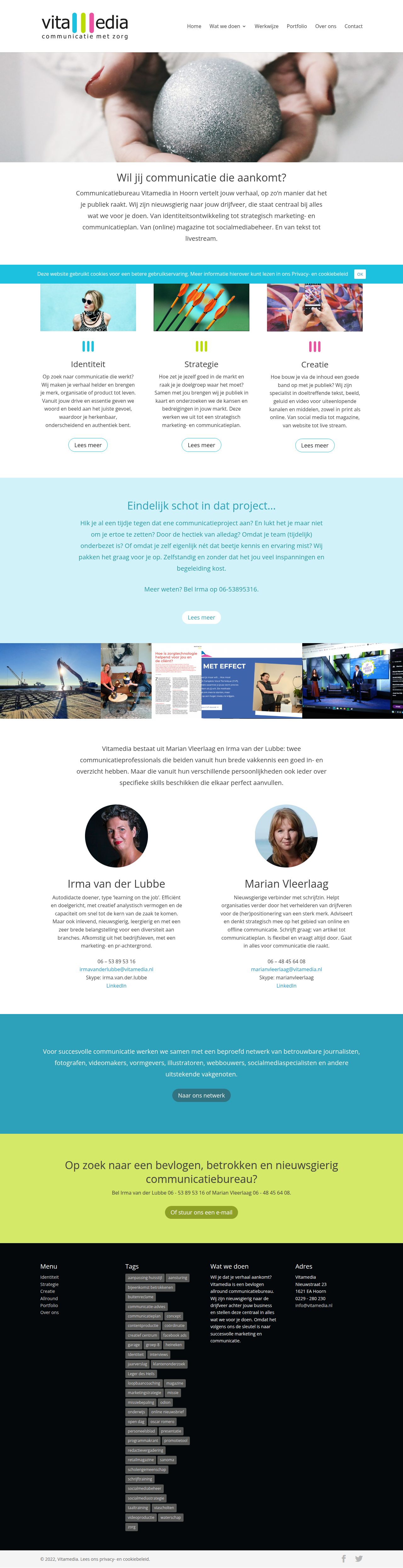
The logo features lowercase typography 'vitamedia' in dark gray with vertical coloured equalizer-style bars integrated into the 'm', paired with the tagline 'communicatie met zorg' below.
- Source
- header-img
- Transparent
- no
The page we read
The capture every value above was read from. Its top, at readable scale.
The read
The company
Positioning
Vitamedia is a full-service Dutch communications agency focused on creating impact that truly hits the mark ('communicatie die aankomt'). They partner with businesses to guide them through identity, strategy, and creative execution. By offering an all-round approach from concept to portfolio-ready work, they ensure brands communicate clearly, effectively, and authentically.
Who it is for
Dutch business owners, marketers, and organisations looking for end-to-end brand strategy, identity development, and creative communication solutions.
Values
Impactful communicationStrategic clarityCreative strategyAll-round executionLook and feel
Pill corners, balanced layout, friendly, approachable.
Reads as
friendlyapproachableprofessionalcolourfulfreshRecurring motifs
three vertical pill bars as category iconsrounded pill CTA buttonstag cloud chips- Theme
- light
- Corners
- pill
- Density
- balanced
- Borders
- none
- Shadows
- none
- Gradients
- no
- Illustration
- none
- Photography
- full-color
- Imagery shows
- hands writing in sand, creative imagery like sunglasses and darts hitting a bullseye, portfolio project showcases, circular portrait photos of team members
- Imagery composition
- centered circular headshots, landscape banners, side-by-side hero gallery strip
- Imagery grading
- natural bright light with vibrant saturation
Motion
Subtle and clean interface adjustments where navigation elements gently shift padding and margins during page load or interactions.
Signature effects
400ms ease-in-out padding and margin shifts on navigation links and header containershover state transitions on navigation elements- Intensity
- subtle
- Speed
- fast
- Easing
- ease-in-out transitions
- Scroll animations
- no
- Hover effects
- yes
- Honours reduced motion
- yes
Voice
The voice reads direct, approachable, professional, engaging.
Tone
directapproachableprofessionalengagingVoice
clearconfidentpurposefulDutch-spokenWords it uses
communicatieidentiteitstrategiecreatiewerkwijzeportfolioWords it avoids
synergydisruptionguaranteed ROI- Calls to action
- Direct questions inviting action or engagement (e.g. 'Wil jij communicatie die aankomt?').
- Headline case
- sentence
- hero headline
- Direct, engaging question designed to spark interest
- navigation
- Structured, straightforward service categories
The recordwhat we measured, and how sure we are
How the brand reads
Vitamedia is an all-round Dutch creative agency specialising in brand identity, strategy, and creative communication solutions.
Known for
Full-service brand strategyCreative identity designImpactful Dutch communication campaignsDesign personality
Fresh, modern, and accessible with a light background surface accentuated by vibrant teal and olive-yellow accent tones.
Design conventions
Light background layout with dark neutral text for crisp readabilityDirect question hero copyStructured navigation outlining core strategic servicesWriting style
Direct, conversational Dutch that asks immediate value-oriented questions and presents clear service capabilities.
Audience, inferred
Dutch companies and entrepreneurs seeking clear brand strategy, modern identity design, and effective marketing communication.
Values, inferred
Impactful communicationStrategic clarityCreative executionEnd-to-end partnershipApplying the brand
Use a clean, bright light layout with #FCFDFD as the primary background and #04080B for crisp readable body text. Apply #2EA1BA (teal) and #D4E968 (lime/olive green) as key accent colors for highlights, headers, and callout boxes. Maintain high-contrast typography and clear structural section titles.
Spacing and accessibility
- Base unit
- 8px
- Scale
- 0.5 · 1 · 2 · 3 · 4 · 6 · 8
- Content margin
- 24px
- Contrast target
- AAA
- Minimum font size
- 16px
- Colourblind safe
- yes
How this was read
- Platform
- WordPress
- Overall confidence
- 0.94
- Font confidence
- 1.00
- Schema version
- v2
The score was built from
Logo found (header-img)Primary color extractedSecondary color extractedFonts found: Open SansCompany name found: VitamediaConfidence is 0 to 1 — a low score is reported, never hidden. Set a floor in your own code and fall back to your defaults below it, rather than shipping the raw score as certainty.
Read something wrong? Sample it again — this page follows within 15 minutes.
Confidence per field · 23 fields
- description
- 0.00
- industry
- 0.00
- tagline
- 0.00
- accessibility.contrast_target
- 0.85
- audience
- 0.85
- background
- 0.85
- brand_intelligence
- 0.85
- contrast
- 0.85
- copywriting
- 0.85
- font_availability
- 0.85
- fonts
- 0.85
- logo_description
- 0.85
- motion
- 0.85
- name
- 0.85
- palette
- 0.85
- positioning_statement
- 0.85
- primary
- 0.85
- secondary
- 0.85
- text
- 0.85
- tone
- 0.85
- values
- 0.85
- visual_style
- 0.85
- voice
- 0.85
Get this as JSON
GET /v1/brands/vitamedia.nl
curl https://api.extractbrand.dev/v1/brands/vitamedia.nl \
-H "Authorization: Bearer YOUR_API_KEY"Sampled from vitamedia.nl on . Own this brand? Claim it or report this page.