
Swarm
Confidence is 0 to 1 — a low score is reported, never hidden. Set a floor in your own code and fall back to your defaults below it, rather than shipping the raw score as certainty.
The kit
Brand colours
Click a colour to copy its hex.
Fonts
- Headline case
- none
- Headline tracking
- tight
- Headline weight
- regular
Logo
The logo consists of three dark circles arranged in a compact triangular cluster alongside the wordmark 'Swarm' in a clean sans-serif typeface.
Sampled from the mark
- Source
- jsonld-org
- Lightness
- 0.00
- Transparent
- yes
The page we read
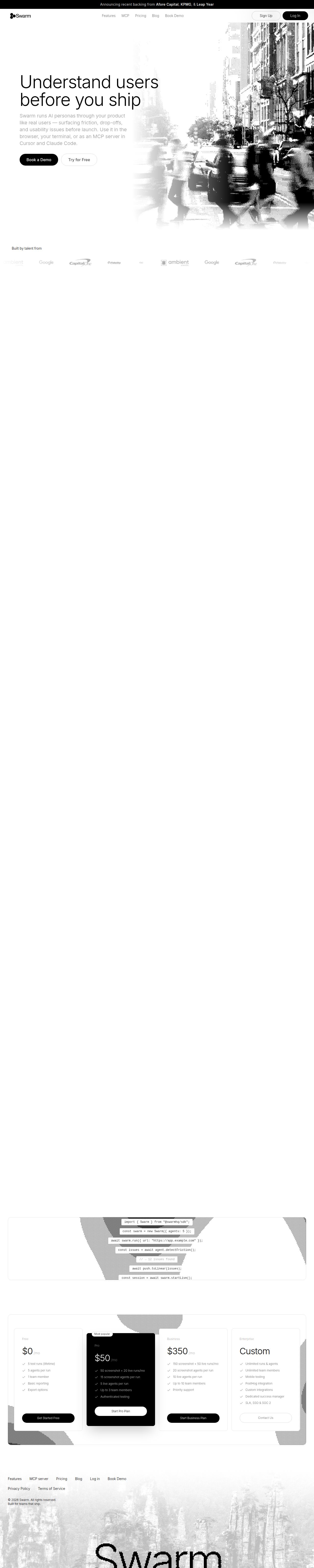
The capture every value above was read from. Its top, at readable scale.
The read
The company
Positioning
Swarm exists to help product teams understand user behavior and identify UX friction before releasing features to production. By sending autonomous AI personas through digital products to simulate real user journeys, Swarm surfaces critical usability issues automatically. This proactive approach empowers software creators to eliminate blind spots and ship polished user experiences with total confidence.
Who it is for
Product managers, software engineers, UX researchers, and startup founders who want to test user flows and catch usability bugs before launch.
Values
Proactive QualityActionable IntelligenceProduct VelocityUser-Centric DesignLook and feel
Pill corners, spacious layout, minimalist, technical.
Reads as
minimalisttechnicalhalftonedsleekdeveloper-focusedRecurring motifs
Halftone dot gridsdithered shadingcode blockssubtle light gray card borders- Theme
- light
- Corners
- pill
- Density
- spacious
- Borders
- solid
- Shadows
- none
- Gradients
- no
- Icons
- filled
- Illustration
- none
- Photography
- grayscale
- Imagery shows
- Urban cityscapes, pedestrians crossing streets, abstract halftone texture overlays
- Imagery composition
- Right-aligned hero graphics fading smoothly into white negative space; dithered halftone cutouts behind card components
- Imagery grading
- Monochrome, high-contrast black and white with visible halftone dot patterns
Motion
Deliberate and technical reveals: the hero headline rises and fades in over 850ms, while subtle terminal-style cursor pulses and AI message cards fade in smoothly.
Signature effects
Hero headline fade-and-rise entryLooping terminal cursor pulseFade-in card reveals for simulated user feedback- Intensity
- subtle
- Speed
- moderate
- Easing
- Smooth ease-out curves and steady linear loops
- Scroll animations
- no
- Hover effects
- yes
- Honours reduced motion
- no
Voice
The voice reads Direct, Action-oriented, Modern, Confident.
Tone
DirectAction-orientedModernConfidentVoice
ClearPragmaticSolutions-focusedWords it uses
AI personasshipusability issuesfind frictionbefore launchWords it avoids
slow downmanual testingblind shippingbugs- Calls to action
- Direct action verbs inviting immediate engagement, such as 'Book Demo'.
- Headline case
- title
- hero headline
- Direct, punchy value proposition focused on pre-launch clarity
- meta description
- Problem-aware, urgent, and solution-driven
- navigation CTA
- Professional and low-friction
The recordwhat we measured, and how sure we are
How the brand reads
Swarm provides AI-driven persona testing to evaluate product usability and surface UX friction before software is launched.
Known for
AI persona usability testingPre-launch friction discoveryAutomated UX feedback loopsDesign personality
Clean, minimalist light-mode aesthetic focused on high clarity, technical precision, and modern SaaS simplicity.
Design conventions
Dominant crisp white backgroundDark charcoal typography for stark contrastSubtle border framingMonospace or terminal-style visual accentsWriting style
Short, declarative sentences with strong active verbs like 'Ship' and 'Understand', avoiding marketing fluff in favor of plain-spoken developer clarity.
Audience, inferred
Product managers, tech leads, UX engineers, and startup builders using modern stacks.
Values, inferred
Proactive QualityActionable IntelligenceProduct VelocityUser-Centric DesignApplying the brand
Use a stark light-mode layout dominated by clean white slide canvas (#FEFEFE) and dark charcoal text (#050505 or #1D1D1D). Keep color accents minimal—use subtle neutral grays for borders and cards, adding a vivid coral red (#FF5F57) sparingly for focal callouts or key metrics. Focus on generous white space and clean typographic hierarchy.
Spacing and accessibility
- Base unit
- 8px
- Scale
- 0.5 · 1 · 2 · 3 · 4 · 6 · 8
- Content margin
- 24px
- Contrast target
- AAA
- Minimum font size
- 16px
- Colourblind safe
- yes
How this was read
- Platform
- NextJsVite
- Overall confidence
- 0.77
- Font confidence
- 1.00
- Schema version
- v2
The score was built from
Logo found (jsonld-org)Primary color extractedSecondary color extractedFonts found: InterCompany name found: SwarmConfidence is 0 to 1 — a low score is reported, never hidden. Set a floor in your own code and fall back to your defaults below it, rather than shipping the raw score as certainty.
Read something wrong? Sample it again — this page follows within 15 minutes.
Confidence per field · 19 fields
- description
- 0.00
- industry
- 0.00
- tagline
- 0.00
- accessibility.contrast_target
- 0.85
- audience
- 0.85
- brand_intelligence
- 0.85
- colors
- 0.85
- contrast
- 0.85
- copywriting
- 0.85
- font_availability
- 0.85
- fonts
- 0.85
- logo_description
- 0.85
- motion
- 0.85
- name
- 0.85
- positioning_statement
- 0.85
- tone
- 0.85
- values
- 0.85
- visual_style
- 0.85
- voice
- 0.85
Get this as JSON
GET /v1/brands/useswarm.co
curl https://api.extractbrand.dev/v1/brands/useswarm.co \
-H "Authorization: Bearer YOUR_API_KEY"Sampled from useswarm.co on . Own this brand? Claim it or report this page.