
Teladoc Health
Confidence is 0 to 1 — a low score is reported, never hidden. Set a floor in your own code and fall back to your defaults below it, rather than shipping the raw score as certainty.
The kit
Brand colours
Click a colour to copy its hex.
Also on the page · 4 colours
Fonts
- Headline case
- none
- Headline tracking
- normal
- Headline weight
- bold
Logo
The Teladoc Health logo consists of a bold teal logotype featuring the word 'Teladoc' alongside 'HEALTH', paired with a multi-colored geometric icon above the lettering.
- Source
- header-img
- Transparent
- no
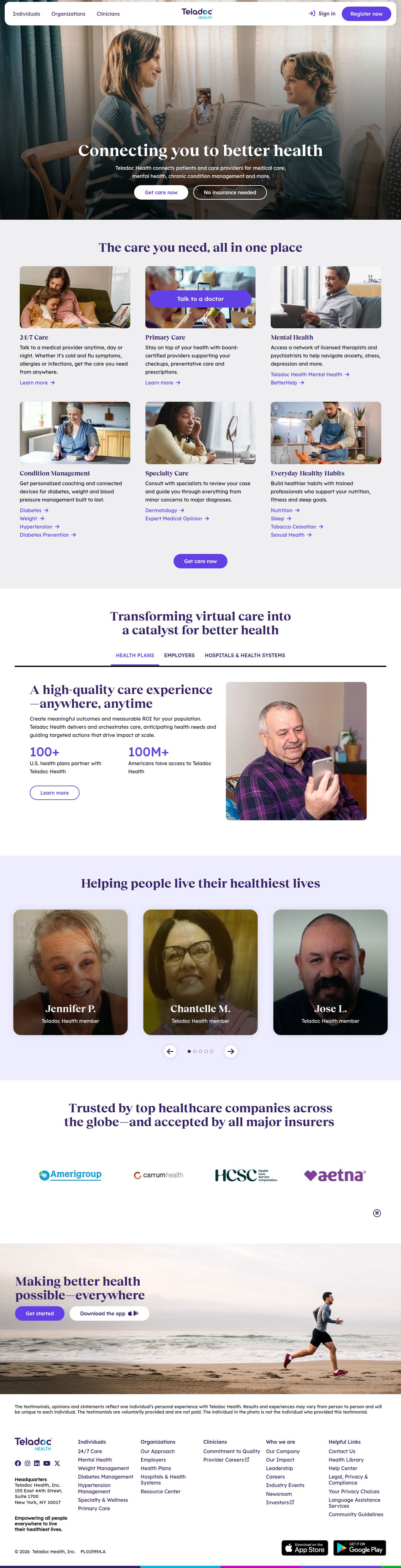
The page we read
The capture every value above was read from. Its top, at readable scale.
The read
The company
Positioning
Teladoc Health exists to bridge the gap between patients and quality healthcare by providing 24/7 virtual access to medical professionals and specialists. Serving both individuals and large organizations, they make comprehensive primary care, mental health support, and specialty care accessible anywhere, anytime. Their integrated approach combines full-spectrum telehealth solutions with expert medical guidance to empower people to live healthier lives.
Who it is for
Individuals seeking convenient virtual care, as well as employers, health plans, and health systems looking to offer telehealth benefits.
Values
AccessibilityComprehensive CareEmpowermentClinical ExcellencePatient-CentricityLook and feel
Rounded corners, spacious layout, approachable, clinical.
Reads as
approachableclinicalmoderntrustworthycaringRecurring motifs
card gridspill-shaped buttonstabbed navigation indicators- Theme
- light
- Corners
- rounded
- Density
- spacious
- Borders
- solid
- Shadows
- subtle
- Gradients
- no
- Icons
- outlined
- Illustration
- none
- Photography
- full-color
- Imagery shows
- diverse patients and healthcare providers using digital devices at home, smiling individuals, active lifestyle scenes
- Imagery composition
- medium close-ups and portrait crops with gentle depth of field, natural lighting, and warm domestic backgrounds
- Imagery grading
- warm, natural, vibrant, true-to-life skin tones
Motion
Continuous and deliberate motion: marquee content tracks loop smoothly while UI elements respond swiftly to user interaction.
Signature effects
60-second continuous looping marquee trackfast hover state transitions on interactive elements- Intensity
- subtle
- Speed
- slow
- Easing
- linear and smooth ease-in-out transitions
- Scroll animations
- no
- Hover effects
- yes
- Honours reduced motion
- yes
Voice
The voice reads Empathetic, Reassuring, Professional, Accessible.
Tone
EmpatheticReassuringProfessionalAccessibleVoice
CompassionateAuthoritativeDirectEncouragingWords it uses
Virtual careTelehealth24/7 accessSpecialty careMental health supportWords it avoids
Cheap healthcareSelf-diagnosisDoctor waiting roomRemotely- Calls to action
- Direct, action-oriented, and reassuring healthcare calls to action
- Headline case
- sentence
- hero headline
- Warm, encouraging, and human-focused ("Connecting you to better health")
- meta description
- Informative, comprehensive, and benefit-driven
The recordwhat we measured, and how sure we are
How the brand reads
Teladoc Health is a global leader in virtual care, offering 24/7 access to doctors, mental health specialists, and expert medical support for individuals and organizations.
Known for
24/7 virtual doctor visitsTelehealth servicesComprehensive mental health supportEnterprise virtual healthcare solutionsDesign personality
Clean, reassuring, and modern light-mode interface using deep purple accents over light grey and neutral backgrounds.
Design conventions
Light background canvas with heavy use of high-contrast purple primary buttonsHuman-centered messaging with clear value propositionsAccessible layout hierarchy suited for patients seeking urgent or routine careWriting style
Clear, empathetic, and concise sentence-case writing that emphasizes connection, accessibility, and expert care.
Audience, inferred
Consumers looking for remote medical care and enterprise benefit leaders seeking modern healthcare solutions.
Values, inferred
AccessibilityComprehensive CareEmpowermentClinical ExcellencePatient-CentricityApplying the brand
Use a clean light-mode palette anchored by off-white background (#F7F7F7) and deep purple accent tones (#6240E8, #351F65). Keep layouts spacious, highly readable, and reassuring, using sentence-case headlines that focus on human connection and care access.
Spacing and accessibility
- Base unit
- 8px
- Scale
- 0.5 · 1 · 2 · 3 · 4 · 6 · 8
- Content margin
- 24px
- Contrast target
- AAA
- Minimum font size
- 16px
- Colourblind safe
- yes
How this was read
- Platform
- Generic
- Overall confidence
- 0.54
- Font confidence
- 0.00
- Schema version
- v2
The score was built from
Logo found (header-img)Primary color extractedSecondary color extractedFonts found: Reckless Neue, Lexend Deca RegularCompany name found: Teladoc HealthNothing could fill
font_availabilityConfidence is 0 to 1 — a low score is reported, never hidden. Set a floor in your own code and fall back to your defaults below it, rather than shipping the raw score as certainty.
Read something wrong? Sample it again — this page follows within 15 minutes.
Confidence per field · 19 fields
- description
- 0.00
- industry
- 0.00
- tagline
- 0.00
- font_availability
- 0.30
- accessibility.contrast_target
- 0.85
- audience
- 0.85
- brand_intelligence
- 0.85
- colors
- 0.85
- contrast
- 0.85
- copywriting
- 0.85
- fonts
- 0.85
- logo_description
- 0.85
- motion
- 0.85
- name
- 0.85
- positioning_statement
- 0.85
- tone
- 0.85
- values
- 0.85
- visual_style
- 0.85
- voice
- 0.85
Get this as JSON
GET /v1/brands/teladochealth.com
curl https://api.extractbrand.dev/v1/brands/teladochealth.com \
-H "Authorization: Bearer YOUR_API_KEY"Sampled from teladochealth.com on . Own this brand? Claim it or report this page.