
Taptap Send
Confidence is 0 to 1 — a low score is reported, never hidden. Set a floor in your own code and fall back to your defaults below it, rather than shipping the raw score as certainty.
The kit
Brand colours
Click a colour to copy its hex.
Fonts
- Headline case
- none
- Headline tracking
- normal
- Headline weight
- bold
Logo
A stylized green bird icon with a red beak, accompanied by the brand text 'Taptap Send' in a clean sans-serif typeface.
Sampled from the mark
- Source
- jsonld-org
- Lightness
- 0.54
- Transparent
- yes
The page we read
The capture every value above was read from. Its top, at readable scale.
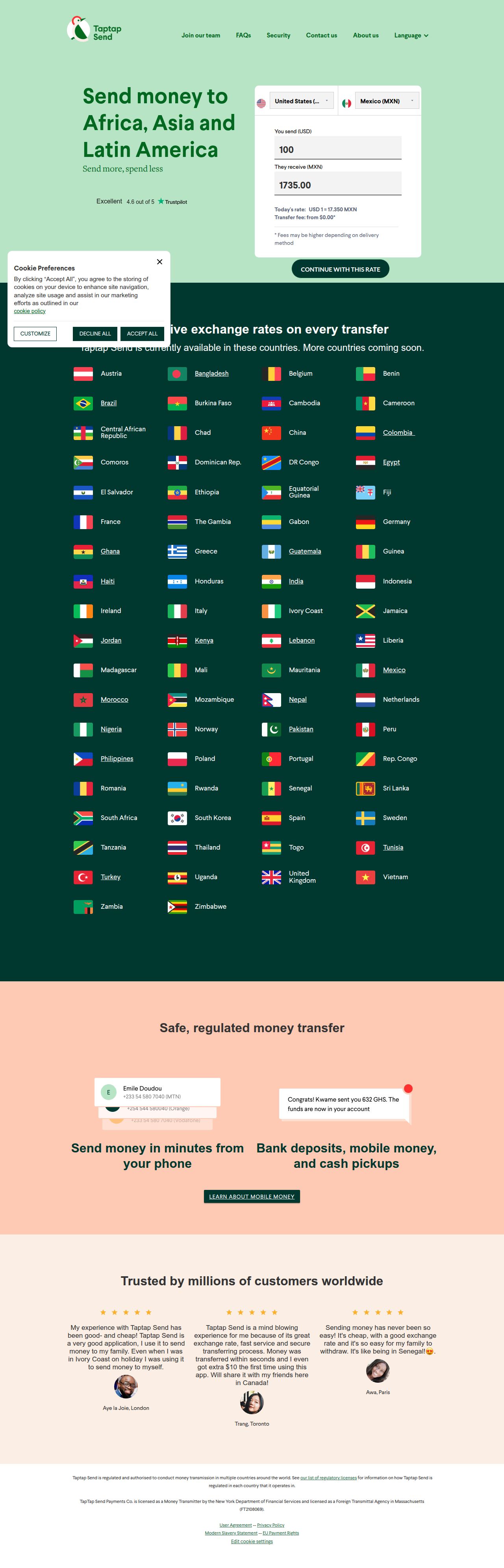
The read
The company
Positioning
Taptap Send exists to make international money transfers fast, affordable, and accessible for diaspora communities sending money to Africa, Asia, and Latin America. The company serves millions of immigrants and expatriates who need a reliable way to support loved ones back home. By eliminating transfer fees on most transactions and offering competitive exchange rates delivered in minutes, Taptap Send distinguishes itself from traditional, fee-heavy remittance services.
Who it is for
Diaspora communities and foreign workers living abroad who regularly send money back home to families in Africa, Asia, and Latin America.
Values
AccessibilityAffordabilitySpeedTrustLook and feel
Rounded corners, balanced layout, friendly, global.
Reads as
friendlyglobalaccessibletrustedmodernRecurring motifs
flag gridspill-shaped action buttonsfloating UI calculator card- Theme
- mixed
- Corners
- rounded
- Density
- balanced
- Borders
- none
- Shadows
- subtle
- Gradients
- no
- Icons
- filled
- Illustration
- flat
- Photography
- full-color
- Imagery shows
- small circular customer portrait photos alongside UI chat bubbles and flag icons
- Imagery composition
- centered, tightly cropped circular avatars with subtle speech bubbles
- Imagery grading
- natural, warm, unedited customer headshots
Motion
Snappy, functional, and reassuring transitions smoothly draw attention to key interaction states without distracting from utility.
Signature effects
Micro-interactions on interactive cards and buttonsLottie vector graphics for localized visual cuesLibraries detected
lottie- Intensity
- subtle
- Speed
- fast
- Easing
- snappy cubic-bezier curves with quick durations
- Scroll animations
- no
- Hover effects
- yes
- Honours reduced motion
- no
Voice
The voice reads Trustworthy, Clear, Direct, Empathetic.
Tone
TrustworthyClearDirectEmpatheticAccessibleVoice
PracticalReassuringStraightforwardWords it uses
Send moneyIn minutesCompetitive exchange ratesNo feesWords it avoids
Expensive feesWire transfer delayComplicated process- Calls to action
- Direct action-oriented verbs inviting immediate, straightforward tasks such as joining the team or contacting support.
- Headline case
- title
- hero headline
- Direct, clear, and focused on core utility and geography.
- meta description
- Reassuring and value-driven, highlighting competitive rates and lack of fees.
- navigation
- Functional, helpful, and multilingual.
The recordwhat we measured, and how sure we are
How the brand reads
Taptap Send is a global fintech platform providing fast, low-cost international money transfer services to Africa, Asia, and Latin America.
Known for
Zero-fee or low-cost money transfersFast multi-country remittanceCompetitive exchange rates for diaspora communitiesDesign personality
Deep, rich dark-green surfaces paired with warm coral and mint accents that convey safety, growth, and modern international connectivity.
Design conventions
Dark brand container sections in deep green (#01382F)High-contrast pastel and mint green CTA elementsMultilingual region-switcher navigationWriting style
Benefit-led, concise, and focused on functional clarity without unnecessary financial jargon.
Audience, inferred
Immigrants, expats, and global workers sending remittance payments to family in developing regions.
Values, inferred
AccessibilityAffordabilitySpeedTrustApplying the brand
Use a dark-mode palette anchored in deep forest green (#01382F) with vibrant mint green (#B7E4C5) and warm coral (#FECAB4) highlights for data visualizations and key takeaways. Keep typography clean, legible, and uncluttered.
Spacing and accessibility
- Base unit
- 8px
- Scale
- 0.5 · 1 · 2 · 3 · 4 · 6 · 8
- Content margin
- 24px
- Contrast target
- AAA
- Minimum font size
- 16px
- Colourblind safe
- yes
How this was read
- Platform
- Webflow
- Overall confidence
- 0.77
- Font confidence
- 1.00
- Schema version
- v2
The score was built from
Logo found (jsonld-org)Primary color extractedSecondary color extractedFonts found: LarsseitCompany name found: Taptap SendConfidence is 0 to 1 — a low score is reported, never hidden. Set a floor in your own code and fall back to your defaults below it, rather than shipping the raw score as certainty.
Read something wrong? Sample it again — this page follows within 15 minutes.
Confidence per field · 23 fields
- description
- 0.00
- industry
- 0.00
- tagline
- 0.00
- accessibility.contrast_target
- 0.85
- audience
- 0.85
- background
- 0.85
- brand_intelligence
- 0.85
- contrast
- 0.85
- copywriting
- 0.85
- font_availability
- 0.85
- fonts
- 0.85
- logo_description
- 0.85
- motion
- 0.85
- name
- 0.85
- palette
- 0.85
- positioning_statement
- 0.85
- primary
- 0.85
- secondary
- 0.85
- text
- 0.85
- tone
- 0.85
- values
- 0.85
- visual_style
- 0.85
- voice
- 0.85
Get this as JSON
GET /v1/brands/taptapsend.com
curl https://api.extractbrand.dev/v1/brands/taptapsend.com \
-H "Authorization: Bearer YOUR_API_KEY"Sampled from taptapsend.com on . Own this brand? Claim it or report this page.