
Starbucks Coffee Company
Confidence is 0 to 1 — a low score is reported, never hidden. Set a floor in your own code and fall back to your defaults below it, rather than shipping the raw score as certainty.
The kit
Brand colours
Click a colour to copy its hex.
Also on the page · 8 colours
Fonts
- Headline case
- none
- Headline tracking
- normal
- Headline weight
- bold
Logo
A circular green emblem featuring the stylized, detailed siren (mermaid) mark in white, framed within a dark green circle.
Sampled from the mark
- Source
- inline-svg
- Lightness
- 0.55
- Transparent
- yes
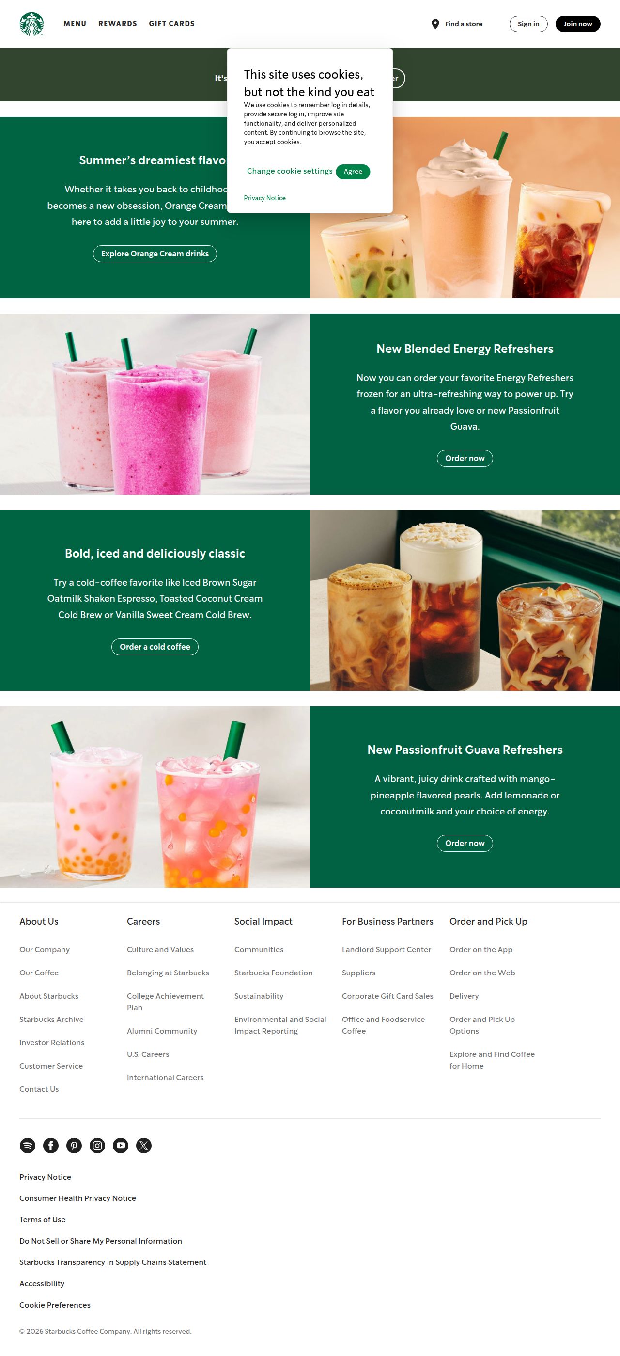
The page we read
The capture every value above was read from. Its top, at readable scale.
The read
The company
Positioning
Starbucks provides handcrafted beverages and convenient food options to daily coffee drinkers and busy consumers on the go. By integrating a seamless digital ordering experience with a globally recognized loyalty program, Starbucks makes everyday routines effortless and rewarding. The brand sets itself apart through customized beverage craft, widespread physical convenience, and a highly accessible rewards ecosystem.
Who it is for
Daily coffee drinkers, commuters, and busy individuals looking for quality handcrafted beverages and quick digital ordering options.
Values
CraftsmanshipConvenienceCommunity & ConnectionCustomer RewardLook and feel
Pill corners, balanced layout, bold, friendly.
Reads as
boldfriendlyvibrantmodularcorporateRecurring motifs
split two-column grid layoutalternating green color block and photo side-by-side modules- Theme
- light
- Corners
- pill
- Density
- balanced
- Borders
- none
- Shadows
- none
- Gradients
- no
- Icons
- filled
- Illustration
- none
- Photography
- full-color
- Imagery shows
- brightly lit cold beverages, layered iced coffee drinks, colorful frozen refreshers with straws
- Imagery composition
- centered close-up shots of iced drinks arranged side-by-side against soft neutral studio backgrounds
- Imagery grading
- natural, warm, vibrant product colors with soft natural lighting
Motion
Responsive and functional UI transitions guide the user smoothly through navigation, button hovers, and account settings.
Signature effects
hover transitions on primary action buttonssmooth navigation dropdown and menu state shifts- Intensity
- subtle
- Speed
- fast
- Easing
- smooth ease-out curves with fast 200ms to 300ms durations
- Scroll animations
- no
- Hover effects
- yes
- Honours reduced motion
- no
Voice
The voice reads Welcoming, Direct, Inviting, Convenient.
Tone
WelcomingDirectInvitingConvenientVoice
WarmClearAccessibleAction-orientedWords it uses
HandcraftedOrder aheadRewardsFind a storeStart an orderWords it avoids
CheapDiscountMass-producedFast food- Calls to action
- Short, clear action verbs inviting immediate engagement (e.g. 'Start an order', 'Join now', 'Sign in').
- Headline case
- sentence
- hero headline
- Warm and optimistic ('It's a great day for coffee')
- CTA buttons
- Direct and action-focused ('Start an order', 'Join now')
- account management
- Clear, direct, and practical ('Card management', 'Payment methods')
The recordwhat we measured, and how sure we are
How the brand reads
Starbucks is a global coffeehouse chain offering handcrafted beverages, fresh food items, and convenient digital ordering options. Through its mobile app and Starbucks® Rewards program, it connects customers to quick pickup and daily perks.
Known for
Handcrafted espresso and coffee drinksStarbucks Rewards loyalty programMobile order and pay convenienceUbiquitous local store locationsDesign personality
Clean, practical, and iconic light-mode interface defined by deep signature greens contrasting against crisp light surfaces.
Design conventions
Prominent high-contrast green CTA buttonsTop navigation focused on Menu, Rewards, and Store FinderSimple, task-driven account and loyalty controlsLight neutral backgrounds with bold typographic contrastWriting style
Short, uplifting headline phrases paired with clear, task-oriented microcopy and direct calls to action.
Audience, inferred
Everyday consumers, coffee enthusiasts, and remote workers looking for reliable, high-quality coffee and convenient mobile ordering.
Values, inferred
CraftsmanshipConvenienceRewardAccessibilityApplying the brand
Design slides on a clean light theme using crisp white or light grey backgrounds (#FDFDFD). Use deep Starbucks green (#056545, #005D3C) as the primary accent color for key focal points, titles, and callout buttons, keeping layouts open, functional, and visually uncluttered.
Spacing and accessibility
- Base unit
- 8px
- Scale
- 0.5 · 1 · 2 · 3 · 4 · 6 · 8
- Content margin
- 24px
- Contrast target
- AAA
- Minimum font size
- 16px
- Colourblind safe
- yes
How this was read
- Platform
- NextJsVite
- Overall confidence
- 0.43
- Font confidence
- 0.50
- Schema version
- v2
The score was built from
Logo not foundPrimary color extractedSecondary color extractedFonts found: SoDoSansCompany name found: Starbucks Coffee CompanyNothing could fill
font_availabilityConfidence is 0 to 1 — a low score is reported, never hidden. Set a floor in your own code and fall back to your defaults below it, rather than shipping the raw score as certainty.
Read something wrong? Sample it again — this page follows within 15 minutes.
Confidence per field · 19 fields
- description
- 0.00
- industry
- 0.00
- tagline
- 0.00
- font_availability
- 0.30
- accessibility.contrast_target
- 0.85
- audience
- 0.85
- brand_intelligence
- 0.85
- colors
- 0.85
- contrast
- 0.85
- copywriting
- 0.85
- fonts
- 0.85
- logo_description
- 0.85
- motion
- 0.85
- name
- 0.85
- positioning_statement
- 0.85
- tone
- 0.85
- values
- 0.85
- visual_style
- 0.85
- voice
- 0.85
Get this as JSON
GET /v1/brands/starbucks.com
curl https://api.extractbrand.dev/v1/brands/starbucks.com \
-H "Authorization: Bearer YOUR_API_KEY"Sampled from starbucks.com on . Own this brand? Claim it or report this page.