
We are Snap Inc.
Confidence is 0 to 1 — a low score is reported, never hidden. Set a floor in your own code and fall back to your defaults below it, rather than shipping the raw score as certainty.
The kit
Brand colours
Click a colour to copy its hex.
Also on the page · 2 colours
Fonts
- Headline case
- none
- Headline tracking
- normal
- Headline weight
- regular
Logo
The 'Snap Inc.' logotype features a bold serif typeface preceded by a four-dot square motif on the left.
- Source
- header-img
- Transparent
- no
The page we read
The capture every value above was read from. Its top, at readable scale.
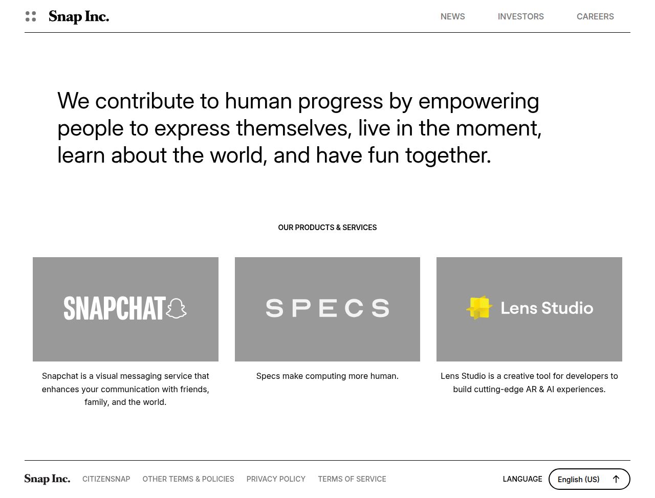
The read
The company
Positioning
The company exists to advance human progress and improve how people live and communicate through the power of the camera. Serving a global audience of everyday users and digital creators, they pioneer visual messaging tools that redefine digital interaction. Their commitment to visual-first communication sets them apart from traditional text-heavy social platforms.
Who it is for
Global consumer audience, smartphone users, and digital creators seeking visual-first communication.
Values
Human progressVisual communicationEmpowermentInnovationLook and feel
Sharp corners, spacious layout, minimalist, editorial.
Reads as
minimalisteditorialcorporatecleantypographicRecurring motifs
thin horizontal dividing linesuppercase section trackingfour-dot square logo icon- Theme
- light
- Corners
- sharp
- Density
- spacious
- Borders
- solid
- Shadows
- none
- Gradients
- no
- Icons
- outlined
- Illustration
- none
Motion
Smooth, deliberate reveals: the main mission statement and product section fade in and rise upward over 800ms upon loading.
Signature effects
800ms opacity and transform fade-up on core load elements- Intensity
- subtle
- Speed
- moderate
- Easing
- Linear 800ms transition curves
- Scroll animations
- no
- Hover effects
- no
- Honours reduced motion
- no
Voice
The voice reads Inspirational, Forward-looking, Purposeful, Clear.
Tone
InspirationalForward-lookingPurposefulClearVoice
VisionaryEmpoweringDirectWords it uses
camerahuman progressempowercommunicateproducts & servicesWords it avoids
social networktextingfeedsalgorithms- Calls to action
- Direct, uppercase section headers introducing core product and corporate offerings.
- Headline case
- upper
- hero headline
- Visionary and mission-driven, focusing on contributing to human progress.
- product section
- Structured and practical, introducing specific apps and services.
The recordwhat we measured, and how sure we are
How the brand reads
The company builds visual communication platforms and camera technologies designed to transform how people express themselves and connect.
Known for
Visual-first social appsCamera technology innovationsEmpowering everyday human communicationDesign personality
Clean, light-mode minimal layout dominated by vast white space, subtle gray structural tones, and focused high-impact typography.
Design conventions
Light background dominant themeHigh-contrast dark typography on whiteMinimalist corporate landing page layoutWriting style
Bold, mission-driven statements centered around human potential and the utility of the camera.
Audience, inferred
Everyday mobile users, Gen Z/Millennial consumers, and digital creators looking for visual messaging.
Values, inferred
Human progressVisual innovationEmpowermentApplying the brand
Design slides with a sleek light-mode visual style. Use bright white background surfaces (#FEFEFE) paired with dark gray (#5A5A5A, #7C7C7C) typography for maximum legibility. Maintain expansive whitespace around impactful, uppercase headlines.
Spacing and accessibility
- Base unit
- 8px
- Scale
- 0.5 · 1 · 2 · 3 · 4 · 6 · 8
- Content margin
- 24px
- Contrast target
- AAA
- Minimum font size
- 16px
- Colourblind safe
- yes
How this was read
- Platform
- Generic
- Overall confidence
- 0.32
- Font confidence
- 0.00
- Schema version
- v2
The score was built from
Logo found (header-img)Primary color not foundSecondary color not foundFonts found: InterCompany name found: We are Snap Inc.Confidence is 0 to 1 — a low score is reported, never hidden. Set a floor in your own code and fall back to your defaults below it, rather than shipping the raw score as certainty.
Read something wrong? Sample it again — this page follows within 15 minutes.
Confidence per field · 19 fields
- description
- 0.00
- industry
- 0.00
- tagline
- 0.00
- accessibility.contrast_target
- 0.30
- contrast
- 0.30
- audience
- 0.85
- brand_intelligence
- 0.85
- colors
- 0.85
- copywriting
- 0.85
- font_availability
- 0.85
- fonts
- 0.85
- logo_description
- 0.85
- motion
- 0.85
- name
- 0.85
- positioning_statement
- 0.85
- tone
- 0.85
- values
- 0.85
- visual_style
- 0.85
- voice
- 0.85
Get this as JSON
GET /v1/brands/snap.com
curl https://api.extractbrand.dev/v1/brands/snap.com \
-H "Authorization: Bearer YOUR_API_KEY"Sampled from snap.com on . Own this brand? Claim it or report this page.