
Seraph
Confidence is 0 to 1 — a low score is reported, never hidden. Set a floor in your own code and fall back to your defaults below it, rather than shipping the raw score as certainty.
The kit
Brand colours
Click a colour to copy its hex.
Fonts
- Headline case
- none
- Headline tracking
- tight
- Headline weight
- bold
Logo
The logo consists of a serif logotype featuring 'Seraph.' with a prominent period at the end. It uses traditional stroke contrast for a refined, professional identity.
- Source
- header-img
- Transparent
- no
The page we read
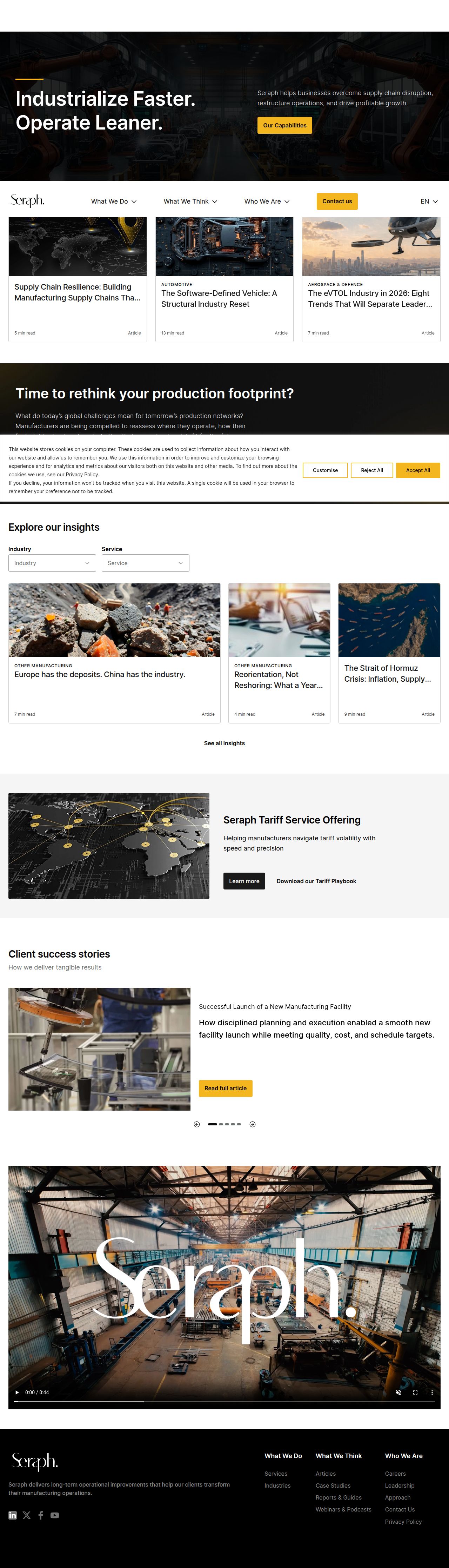
The capture every value above was read from. Its top, at readable scale.
The read
The company
Positioning
Seraph exists to solve complex operational and manufacturing challenges for industrial clients worldwide. They serve global enterprises requiring supply chain optimization, rapid industrialization, and corporate restructuring. By combining deep hands-on industry expertise with strategic turnarounds, Seraph empowers organizations to operate leaner and scale efficiently.
Who it is for
C-suite executives, directors of operations, and supply chain leaders in global manufacturing and industrial sectors.
Values
Operational ExcellenceSupply Chain ResilienceEfficiency & SpeedStrategic TransformationLook and feel
Rounded corners, balanced layout, industrial, corporate.
Reads as
industrialcorporateauthoritativemodernstructuredRecurring motifs
gold accent lines above section titlescard-based editorial gridsdark hero video overlay branding- Theme
- light
- Corners
- rounded
- Density
- balanced
- Borders
- solid
- Shadows
- none
- Gradients
- no
- Icons
- outlined
- Illustration
- none
- Photography
- full-color
- Imagery shows
- industrial factory floors, automated assembly lines, global supply chain maps, advanced manufacturing machinery
- Imagery composition
- wide-angle shots, high-angle industrial views, framed focal points with bold overlay text
- Imagery grading
- rich contrast, warm lighting accents, dark technical tones
Motion
Subtle and functional reveals where images smoothly fade in upon load and interactive elements respond with crisp hover transitions.
Signature effects
fade-in on lazy-loaded images over 300mssmooth hover transitions on interactive elementscarousel scrollingLibraries detected
swiper- Intensity
- subtle
- Speed
- fast
- Easing
- standard ease-out and smooth cubic-bezier curves
- Scroll animations
- no
- Hover effects
- yes
- Honours reduced motion
- yes
Voice
The voice reads professional, authoritative, results-oriented, direct.
Tone
professionalauthoritativeresults-orienteddirectVoice
expertdecisivepragmaticWords it uses
IndustrializeOperate LeanerSupply Chain ImprovementRestructuringTurnaroundsWords it avoids
synergydisruptivefluffquick fix- Calls to action
- Action-oriented and imperative, focusing on immediate operational outcomes.
- Headline case
- title
- hero headline
- Imperative, punchy, and outcome-driven
- meta description
- Authoritative, corporate, and capability-focused
The recordwhat we measured, and how sure we are
How the brand reads
Seraph is a global operations and strategy consulting firm specializing in supply chain improvement, restructuring, and turnarounds for industrial businesses.
Known for
Supply chain restructuringOperational turnaroundsLean industrializationManufacturing strategyDesign personality
Corporate, clean, and highly structured with a dominant light background grounded by strong dark industrial typography.
Design conventions
Light neutral backgrounds paired with stark dark textHigh-contrast call-to-action buttonsDirect, imperative headline copyWriting style
Short, action-driven statements emphasizing speed, lean operations, and measurable operational results without corporate jargon.
Audience, inferred
Global industrial executives, chief operating officers, and supply chain directors.
Values, inferred
Operational ExcellenceSupply Chain ResilienceEfficiency & SpeedStrategic TransformationApplying the brand
Maintain a clean, high-contrast light theme using #FDFDFD canvas with heavy dark gray typography (#060505, #1A1A19) and subtle warm neutral accents (#AFA295). Use bold imperative headers with concise bullet points.
Spacing and accessibility
- Base unit
- 8px
- Scale
- 0.5 · 1 · 2 · 3 · 4 · 6 · 8
- Content margin
- 24px
- Contrast target
- AAA
- Minimum font size
- 16px
- Colourblind safe
- yes
How this was read
- Platform
- WordPress
- Overall confidence
- 0.64
- Font confidence
- 0.50
- Schema version
- v2
The score was built from
Logo found (header-img)Primary color extractedSecondary color not foundFonts found: Inter Semi, InterCompany name found: SeraphNothing could fill
font_availabilitysecondaryConfidence is 0 to 1 — a low score is reported, never hidden. Set a floor in your own code and fall back to your defaults below it, rather than shipping the raw score as certainty.
Read something wrong? Sample it again — this page follows within 15 minutes.
Confidence per field · 23 fields
- description
- 0.00
- industry
- 0.00
- secondary
- 0.00
- tagline
- 0.00
- font_availability
- 0.30
- accessibility.contrast_target
- 0.85
- audience
- 0.85
- background
- 0.85
- brand_intelligence
- 0.85
- contrast
- 0.85
- copywriting
- 0.85
- fonts
- 0.85
- logo_description
- 0.85
- motion
- 0.85
- name
- 0.85
- palette
- 0.85
- positioning_statement
- 0.85
- primary
- 0.85
- text
- 0.85
- tone
- 0.85
- values
- 0.85
- visual_style
- 0.85
- voice
- 0.85
Get this as JSON
GET /v1/brands/seraph.com
curl https://api.extractbrand.dev/v1/brands/seraph.com \
-H "Authorization: Bearer YOUR_API_KEY"Sampled from seraph.com on . Own this brand? Claim it or report this page.