
PaperToaster
Confidence is 0 to 1 — a low score is reported, never hidden. Set a floor in your own code and fall back to your defaults below it, rather than shipping the raw score as certainty.
The kit
Brand colours
Click a colour to copy its hex.
Fonts
- Headline case
- none
- Headline tracking
- normal
- Headline weight
- regular
Logo
A geometric mark featuring a stylised black diamond or paper-plane shape next to the wordmark 'Papertoaster' in a bold sans-serif typeface.
- Source
- header-img
- Transparent
- no
The page we read
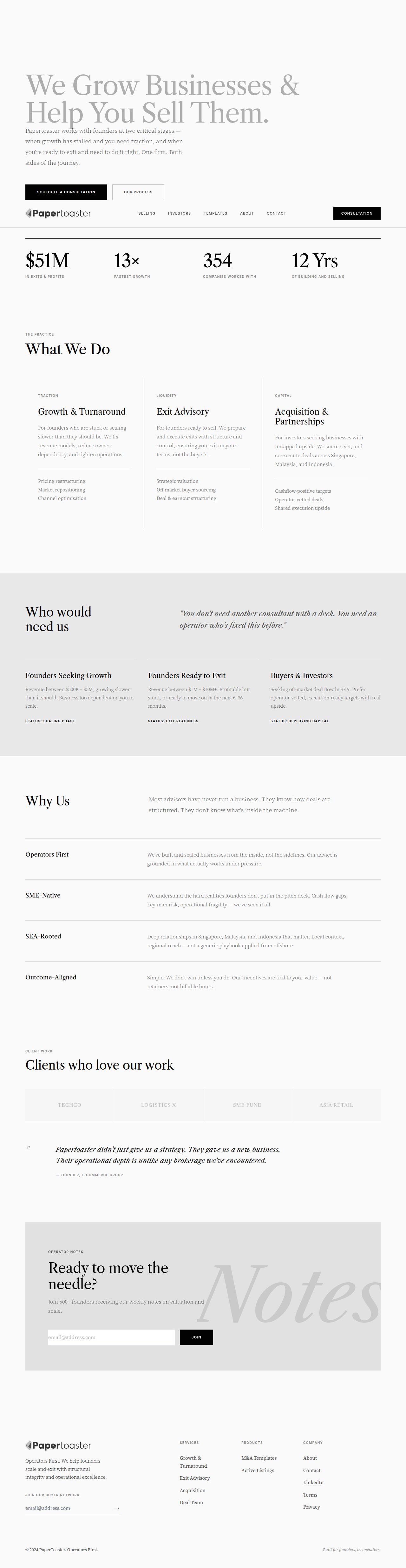
The capture every value above was read from. Its top, at readable scale.
The read
The company
Positioning
PaperToaster provides hands-on growth advisory and exit services tailored for business founders and operators. Built on an 'Operators First' mindset, the company bridges the gap between scaling day-to-day operations and executing successful business sales. They differentiate themselves through practical, real-world operational experience rather than traditional theoretical advisory.
Who it is for
Founders, business owners, operators, and investors looking to scale operations or prepare a business for sale.
Values
Operators FirstPragmatic GrowthExit ReadinessTransparencyLook and feel
Sharp corners, spacious layout, editorial, minimalist.
Reads as
editorialminimalistcorporatetypographicalstructuredRecurring motifs
thin horizontal dividersuppercase tracking metadata labelshigh-contrast black buttonsbackground typography watermarks- Theme
- light
- Corners
- sharp
- Density
- spacious
- Borders
- solid
- Shadows
- none
- Gradients
- no
- Illustration
- none
Motion
Smooth and deliberate section reveals elevate the site content as layout sections translate and fade into view during page scroll.
Signature effects
650ms section opacity and transform scroll-revealshover state transitions on interactive elements- Intensity
- subtle
- Speed
- moderate
- Easing
- custom ease-out curve with custom cubic-bezier (0.16, 1, 0.3, 1) timing
- Scroll animations
- no
- Hover effects
- yes
- Honours reduced motion
- yes
Voice
The voice reads direct, pragmatic, confident, action-oriented.
Tone
directpragmaticconfidentaction-orientedVoice
authoritativeconcisegroundedno-nonsenseWords it uses
Operators FirstGrow BusinessesSell ThemTraction GrowthOperator NotesWords it avoids
synergyholistic advisoryparadigmsthought leadership- Calls to action
- Direct, short, and outcome-oriented, focusing on immediate contact or operational templates.
- Headline case
- title
- hero headline
- Bold, clear, and focused on tangible outcomes.
- value proposition
- Direct and contrasting real operational experience against traditional advisors.
The recordwhat we measured, and how sure we are
How the brand reads
PaperToaster helps business owners scale their operations and navigate successful exits. Founded by former operators, they deliver practical advisory, growth frameworks, and M&A support.
Known for
Operator-led advisoryBusiness growth and scalingSell-side prep and exit executionDesign personality
Clean, light-mode minimal layout with high contrast dark typography and subtle structured grey borders.
Design conventions
Light-background canvas (#F9F9F9)High-contrast dark typography (#020202)Structured subtle section revealsClear top-level navigationWriting style
Clear, concise, and direct sentence structures that prioritize real-world results over advisory jargon.
Audience, inferred
Founders, business owners, and investors looking to scale and eventually exit their businesses.
Values, inferred
Operators FirstPragmatic GrowthExit ReadinessTransparencyApplying the brand
Design slides with a clean light-mode theme using an off-white background (#F9F9F9) and near-black text (#020202) for maximum readability. Use light grey tones (#E2E2E2) for container borders, cards, and divider lines. Keep layouts simple, focused on punchy headline statements, and avoid unnecessary visual clutter.
Spacing and accessibility
- Base unit
- 8px
- Scale
- 0.5 · 1 · 2 · 3 · 4 · 6 · 8
- Content margin
- 24px
- Contrast target
- AAA
- Minimum font size
- 16px
- Colourblind safe
- yes
How this was read
- Platform
- Tailwind
- Overall confidence
- 0.84
- Font confidence
- 1.00
- Schema version
- v2
The score was built from
Logo found (header-img)Primary color extractedSecondary color not foundFonts found: Libre Caslon Text, Source Serif 4Company name found: PaperToasterPlatform: Tailwind CSSConfidence is 0 to 1 — a low score is reported, never hidden. Set a floor in your own code and fall back to your defaults below it, rather than shipping the raw score as certainty.
Read something wrong? Sample it again — this page follows within 15 minutes.
Confidence per field · 23 fields
- background
- 0.00
- description
- 0.00
- industry
- 0.00
- palette
- 0.00
- secondary
- 0.00
- tagline
- 0.00
- accessibility.contrast_target
- 0.30
- contrast
- 0.30
- audience
- 0.85
- brand_intelligence
- 0.85
- copywriting
- 0.85
- font_availability
- 0.85
- fonts
- 0.85
- logo_description
- 0.85
- motion
- 0.85
- name
- 0.85
- positioning_statement
- 0.85
- primary
- 0.85
- text
- 0.85
- tone
- 0.85
- values
- 0.85
- visual_style
- 0.85
- voice
- 0.85
Get this as JSON
GET /v1/brands/papertoaster.com
curl https://api.extractbrand.dev/v1/brands/papertoaster.com \
-H "Authorization: Bearer YOUR_API_KEY"Sampled from papertoaster.com on . Own this brand? Claim it or report this page.