
Spotify
Confidence is 0 to 1 — a low score is reported, never hidden. Set a floor in your own code and fall back to your defaults below it, rather than shipping the raw score as certainty.
The kit
Brand colours
Click a colour to copy its hex.
Fonts
- Headline case
- none
- Headline tracking
- tight
- Headline weight
- bold
Logo
The logo features three horizontal curved sound wave lines enclosed within a solid circle, representing audio waves and streaming.
- Source
- header-img
- Transparent
- no
The page we read
The capture every value above was read from. Its top, at readable scale.
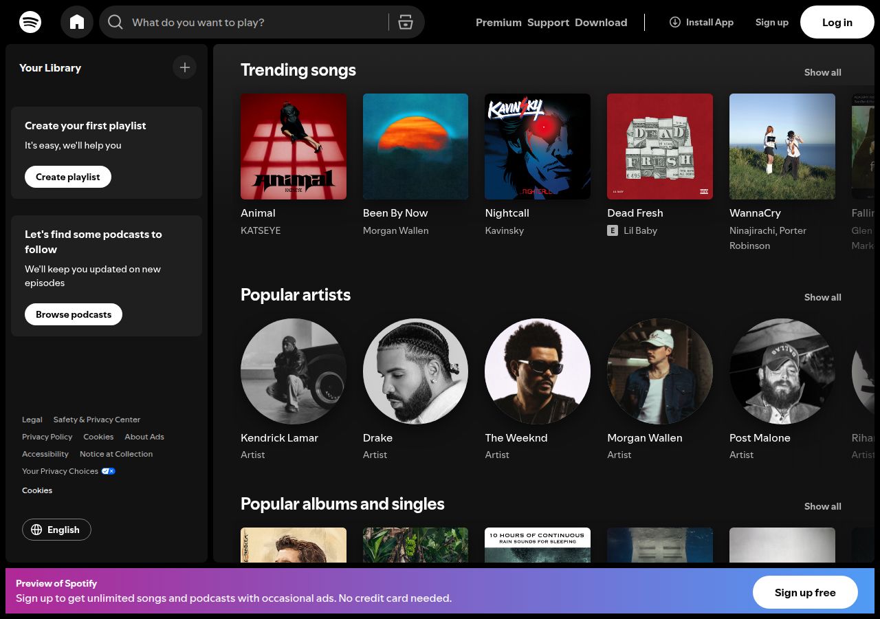
The read
The company
Positioning
Spotify provides a ubiquitous audio streaming web player designed to give listeners instant access to music and podcasts anywhere. Built for music fans and podcast lovers globally, the web interface offers a seamless, immersive listening experience. By pairing recognizable brand accents like Spotify green with a focused dark interface, Spotify ensures content remains front and center.
Who it is for
Global music listeners, podcast fans, and audio creators using web browsers
Values
AccessibilitySeamless StreamingContent-First DesignLook and feel
Rounded corners, balanced layout, gradients, dark-mode, media-rich.
Reads as
dark-modemedia-richmoderncontent-focusedsleekRecurring motifs
pill-shaped action buttonscircular artist portraitssquare media cardsbottom promotional banner with linear gradient- Theme
- dark
- Corners
- rounded
- Density
- balanced
- Borders
- none
- Shadows
- none
- Gradients
- yes
- Icons
- outlined
- Illustration
- none
- Photography
- full-color
- Imagery shows
- album artwork, artist portraits, music cover art
- Imagery composition
- square album covers, circular artist crops, grid-aligned content cards
- Imagery grading
- vibrant full-color artwork alongside monochrome and stylized portrait photography
Motion
Snappy and functional interaction states where media elements like cover art quickly adjust opacity over 250ms on load or interaction.
Signature effects
opacity fade-in on image assetsresponsive hover state transitions on audio controls- Intensity
- subtle
- Speed
- fast
- Easing
- responsive curves with snappy ease-out timing
- Scroll animations
- no
- Hover effects
- yes
- Honours reduced motion
- yes
Voice
The voice reads modern, direct, user-centric, functional.
Tone
moderndirectuser-centricVoice
functionalapproachableWords it uses
PlayListenWeb PlayerMusicWords it avoids
ClutteredLegacyComplex- Calls to action
- Action-oriented and direct, focusing on immediate playback and navigation
- Headline case
- sentence
- hero headline
- Direct and functional welcoming the user to the web player
- CTA
- Action-focused and inviting
The recordwhat we measured, and how sure we are
How the brand reads
Spotify is a leading digital music and podcast streaming service providing access to millions of songs and audio tracks.
Known for
Music streamingPodcastsPersonalized playlistsSpotify Green designDesign personality
Dark, focused, and immersive dark-mode web player interface with vibrant accent colors highlighting key actions.
Design conventions
Dominant dark slate and black background (#0F0F0F, #202020)Vibrant green accent CTA buttons (#1ED760)High-contrast subtle grey typography (#B3B3B3)Writing style
Short, direct, action-driven copy centered around listening, searching, and discovering media.
Audience, inferred
Global music listeners, podcast fans, and audio creators using web browsers
Values, inferred
AccessibilitySeamless StreamingContent-First DesignApplying the brand
Use a dark-mode theme grounded in deep charcoal and black backgrounds (#0F0F0F). Reserve vibrant Spotify green (#1ED760) exclusively for key callouts, play buttons, and primary highlights. Keep typography crisp with light grey and white text to maintain high contrast and clarity.
Spacing and accessibility
- Base unit
- 8px
- Scale
- 0.5 · 1 · 2 · 3 · 4 · 6 · 8
- Content margin
- 24px
- Contrast target
- AAA
- Minimum font size
- 16px
- Colourblind safe
- yes
How this was read
- Platform
- Generic
- Overall confidence
- 0.44
- Font confidence
- 0.00
- Schema version
- v2
The score was built from
Logo found (header-img)Primary color extractedSecondary color not foundFonts found: SpotifyMixUICompany name found: SpotifyNothing could fill
font_availabilitytextsecondaryConfidence is 0 to 1 — a low score is reported, never hidden. Set a floor in your own code and fall back to your defaults below it, rather than shipping the raw score as certainty.
Read something wrong? Sample it again — this page follows within 15 minutes.
Confidence per field · 23 fields
- description
- 0.00
- industry
- 0.00
- secondary
- 0.00
- tagline
- 0.00
- text
- 0.00
- accessibility.contrast_target
- 0.30
- contrast
- 0.30
- font_availability
- 0.30
- audience
- 0.85
- background
- 0.85
- brand_intelligence
- 0.85
- copywriting
- 0.85
- fonts
- 0.85
- logo_description
- 0.85
- motion
- 0.85
- name
- 0.85
- palette
- 0.85
- positioning_statement
- 0.85
- primary
- 0.85
- tone
- 0.85
- values
- 0.85
- visual_style
- 0.85
- voice
- 0.85
Get this as JSON
GET /v1/brands/open.spotify.com
curl https://api.extractbrand.dev/v1/brands/open.spotify.com \
-H "Authorization: Bearer YOUR_API_KEY"Sampled from open.spotify.com on . Own this brand? Claim it or report this page.