
Confidence is 0 to 1 — a low score is reported, never hidden. Set a floor in your own code and fall back to your defaults below it, rather than shipping the raw score as certainty.
The kit
Brand colours
Click a colour to copy its hex.
Also on the page · 7 colours
Fonts
- Headline case
- none
- Headline tracking
- normal
- Headline weight
- regular
Logo
The wordmark 'Linked' followed by a solid rounded square containing the lowercase letters 'in'.
- Source
- favicon
- Transparent
- no
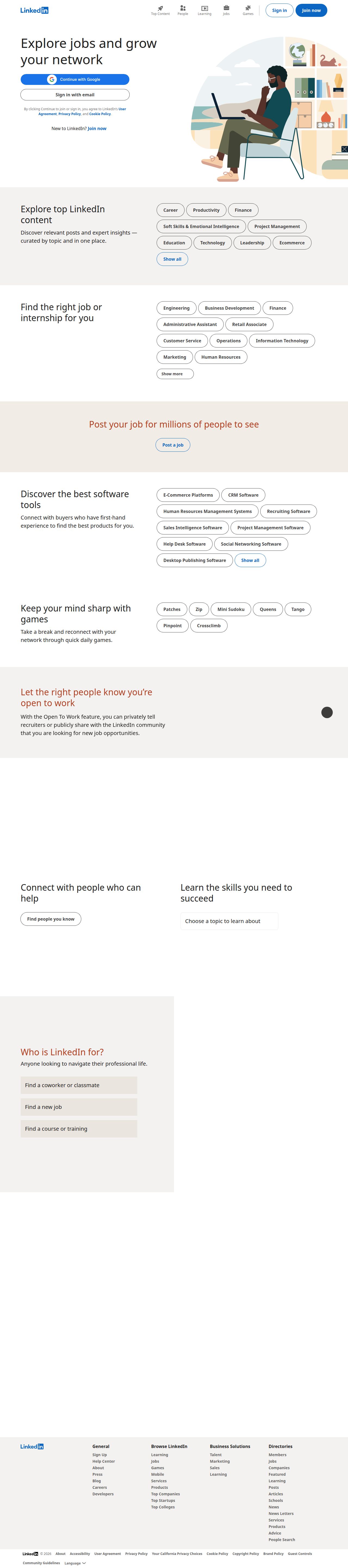
The page we read
The capture every value above was read from. Its top, at readable scale.
The read
The company
Positioning
LinkedIn exists to connect the world's professionals to make them more productive and successful. It serves over one billion individual workers, job seekers, and businesses globally by providing a unified platform for professional networking and career development. What sets LinkedIn apart is its vast global network, combining identity management, job recruitment, continuous learning, and industry insights in one centralized ecosystem.
Who it is for
Global working professionals, job seekers, recruiters, enterprise businesses, and content creators.
Values
Professional GrowthGlobal ConnectivityKnowledge SharingOpportunity AccessCommunity EngagementLook and feel
Pill corners, spacious layout, professional, corporate.
Reads as
professionalcorporatecleanaccessiblemodernRecurring motifs
pill-shaped filter chipsneutral alternating section blockssubtle outlined buttons- Theme
- light
- Corners
- pill
- Density
- spacious
- Borders
- solid
- Shadows
- none
- Gradients
- no
- Icons
- outlined
- Illustration
- flat
Motion
Snappy and responsive micro-interactions provide subtle visual feedback on user engagement across navigation and call-to-action elements.
Signature effects
subtle hover-state color shifts and lifts on buttons and navigation itemsquick interactive feedback transitions on UI components- Intensity
- subtle
- Speed
- fast
- Easing
- standard ease-out and smooth cubic-bezier transitions
- Scroll animations
- no
- Hover effects
- yes
- Honours reduced motion
- no
Voice
The voice reads professional, welcoming, authoritative, enabling.
Tone
professionalwelcomingauthoritativeenablingVoice
invitingcleardirectstructuredWords it uses
professional identityprofessional networkknowledge, insights and opportunitiescommunityjoin nowWords it avoids
casualsocial feedgossipunprofessionalfriends- Calls to action
- Direct, action-oriented verbs inviting immediate participation (e.g., 'Sign in', 'Join now').
- Headline case
- sentence
- hero headline
- warm, inclusive, and welcoming
- navigation and content categories
- utility-focused, clear, and organized
- meta description
- stat-driven, authoritative, and value-packed
The recordwhat we measured, and how sure we are
How the brand reads
LinkedIn is the world's largest professional social network, connecting individuals and organizations to build professional identities, foster business relationships, and share industry knowledge.
Known for
Professional networkingJob listings and recruitmentLinkedIn LearningB2B networking and professional identity managementDesign personality
Clean, light-mode, and structured with an inviting corporate feel focused on utility and clarity.
Design conventions
Dominant off-white canvas with high contrast dark body textDistinct primary brand accent buttons for key actionsStructured top navigation categorized by feature verticalsWriting style
Clear, direct, sentence-case headlines focused on community, network value, and professional empowerment.
Audience, inferred
Global working professionals, job seekers, recruiters, enterprise businesses, and content creators.
Values, inferred
Professional GrowthGlobal ConnectivityKnowledge SharingOpportunity AccessCommunity EngagementApplying the brand
Use a clean light-mode palette anchored by off-white (#FBFAF9) backgrounds, rich black (#000000) typography for maximum readability, and signature professional blue (#0A66C2) accents for key callouts and interactive elements. Avoid heavy dark surfaces.
Spacing and accessibility
- Base unit
- 8px
- Scale
- 0.5 · 1 · 2 · 3 · 4 · 6 · 8
- Content margin
- 24px
- Contrast target
- AAA
- Minimum font size
- 16px
- Colourblind safe
- yes
How this was read
- Platform
- Generic
- Overall confidence
- 0.64
- Font confidence
- 0.50
- Schema version
- v2
The score was built from
Logo found (favicon)Primary color extractedSecondary color extractedFonts found: RobotoCompany name found: LinkedInConfidence is 0 to 1 — a low score is reported, never hidden. Set a floor in your own code and fall back to your defaults below it, rather than shipping the raw score as certainty.
Read something wrong? Sample it again — this page follows within 15 minutes.
Confidence per field · 19 fields
- description
- 0.00
- industry
- 0.00
- tagline
- 0.00
- accessibility.contrast_target
- 0.85
- audience
- 0.85
- brand_intelligence
- 0.85
- colors
- 0.85
- contrast
- 0.85
- copywriting
- 0.85
- font_availability
- 0.85
- fonts
- 0.85
- logo_description
- 0.85
- motion
- 0.85
- name
- 0.85
- positioning_statement
- 0.85
- tone
- 0.85
- values
- 0.85
- visual_style
- 0.85
- voice
- 0.85
Get this as JSON
GET /v1/brands/linkedin.com
curl https://api.extractbrand.dev/v1/brands/linkedin.com \
-H "Authorization: Bearer YOUR_API_KEY"Sampled from linkedin.com on . Own this brand? Claim it or report this page.