
Home
Confidence is 0 to 1 — a low score is reported, never hidden. Set a floor in your own code and fall back to your defaults below it, rather than shipping the raw score as certainty.
The kit
Brand colours
Click a colour to copy its hex.
Fonts
- Headline case
- none
- Headline tracking
- tight
- Headline weight
- bold
Logo
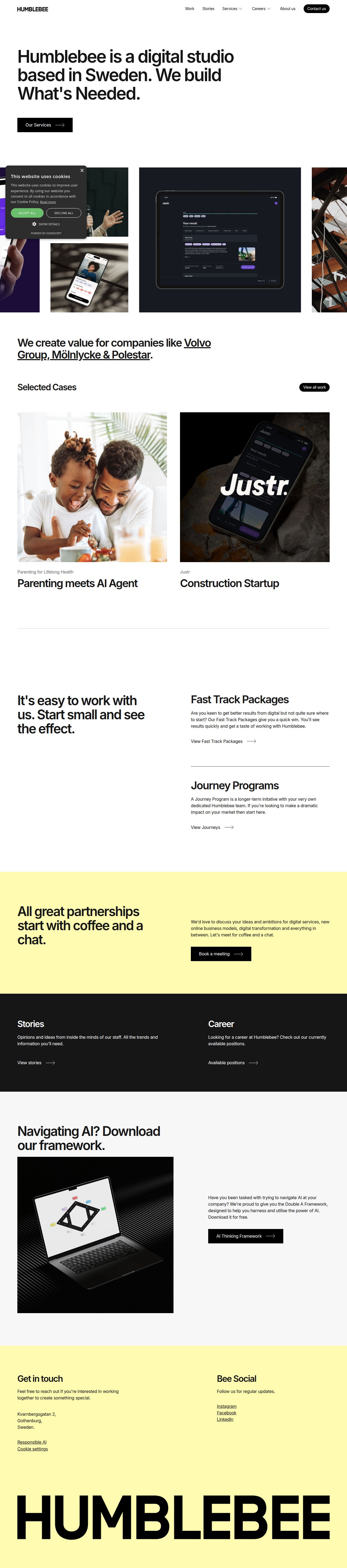
The brand uses a bold typographic wordmark 'HUMBLEBEE' in a wide, heavy sans-serif typeface, displayed both in the header and as a large scale footer mark.
- Source
- header-img
- Transparent
- no
The page we read
The capture every value above was read from. Its top, at readable scale.
The read
The company
Positioning
Humblebee is a Swedish digital studio that exists to conceive and build business-critical digital products and services. Serving forward-thinking organizations, they cut through digital noise by focusing strictly on purpose-driven execution. What sets them apart is their pragmatic, hands-on commitment to building only 'What's Needed' across strategy, design, and technology.
Who it is for
Businesses and organizational decision-makers looking to build high-impact, business-critical digital products and services.
Values
PragmatismPurpose-driven creationBusiness impactStrategic clarityLook and feel
Pill corners, spacious layout, minimalist, editorial.
Reads as
minimalisteditorialscandinavianmoderntypography-drivenRecurring motifs
pill-shaped buttonsunderlined text links with right arrowscolor-blocked horizontal sections- Theme
- light
- Corners
- pill
- Density
- spacious
- Borders
- solid
- Shadows
- none
- Gradients
- no
- Icons
- outlined
- Illustration
- none
- Photography
- full-color
- Imagery shows
- lifestyle photos of people interacting with digital products, UI product mockups, and tech hardware renders
- Imagery composition
- grid arrangements, framed UI mockups on neutral backgrounds, full-width content blocks
- Imagery grading
- natural tone lifestyle photography paired with high-contrast, dark UI renders
Motion
Minimal and continuous: text marquees scroll infinitely in a slow, linear loop across the page while interactive elements respond with swift state transitions on hover.
Signature effects
looping marquee scrollhover state transitions- Intensity
- subtle
- Speed
- slow
- Easing
- linear continuous looping paired with fast UI state transitions
- Scroll animations
- no
- Hover effects
- yes
- Honours reduced motion
- no
Voice
The voice reads direct, pragmatic, confident, modern.
Tone
directpragmaticconfidentmodernVoice
focusedconcisepurpose-drivenWords it uses
What's Neededdigital productsbusiness criticalstudiostrategydesigntechnologyWords it avoids
bloatfluffdisruptive synergyall-in-one platform- Calls to action
- Short, direct noun phrases for navigation and clear action leads.
- Headline case
- sentence
- hero headline
- Direct, punchy, and purpose-driven statement of intent
- navigation
- Functional, organized, and straightforward single-word categories
The recordwhat we measured, and how sure we are
How the brand reads
Humblebee is a Sweden-based digital studio that designs and develops business-critical digital products and services.
Known for
Creating purpose-driven digital productsA pragmatic 'build what is needed' philosophyDigital product strategy and designDesign personality
Modern, spacious, and deliberate light-mode aesthetic punctuated with pale yellow highlights and sharp dark typography.
Design conventions
Light-theme dominant layoutsHigh-contrast black text on off-white canvasSoft yellow background accents for visual interestClean multi-column grid layoutWriting style
Short, punchy sentences stripped of corporate jargon; focuses heavily on action-oriented, direct outcomes.
Audience, inferred
Business leaders, product owners, and organizations seeking targeted digital product strategy and development.
Values, inferred
PragmatismPurpose-driven creationBusiness impactStrategic clarityApplying the brand
Use an off-white background (#FDFDFD) with strong dark dark-grey/black (#0F0F0F) body text. Accent key callouts, highlights, or section covers with pale yellow (#FEFBB1). Keep typography clean, minimalist, and uncluttered.
Spacing and accessibility
- Base unit
- 8px
- Scale
- 0.5 · 1 · 2 · 3 · 4 · 6 · 8
- Content margin
- 24px
- Contrast target
- AAA
- Minimum font size
- 16px
- Colourblind safe
- yes
How this was read
- Platform
- Webflow
- Overall confidence
- 0.84
- Font confidence
- 1.00
- Schema version
- v2
The score was built from
Logo found (header-img)Primary color extractedSecondary color not foundFonts found: InterCompany name found: HomeNothing could fill
secondaryConfidence is 0 to 1 — a low score is reported, never hidden. Set a floor in your own code and fall back to your defaults below it, rather than shipping the raw score as certainty.
Read something wrong? Sample it again — this page follows within 15 minutes.
Confidence per field · 23 fields
- description
- 0.00
- industry
- 0.00
- secondary
- 0.00
- tagline
- 0.00
- accessibility.contrast_target
- 0.85
- audience
- 0.85
- background
- 0.85
- brand_intelligence
- 0.85
- contrast
- 0.85
- copywriting
- 0.85
- font_availability
- 0.85
- fonts
- 0.85
- logo_description
- 0.85
- motion
- 0.85
- name
- 0.85
- palette
- 0.85
- positioning_statement
- 0.85
- primary
- 0.85
- text
- 0.85
- tone
- 0.85
- values
- 0.85
- visual_style
- 0.85
- voice
- 0.85
Get this as JSON
GET /v1/brands/humblebee.se
curl https://api.extractbrand.dev/v1/brands/humblebee.se \
-H "Authorization: Bearer YOUR_API_KEY"Sampled from humblebee.se on . Own this brand? Claim it or report this page.