
GSK
Confidence is 0 to 1 — a low score is reported, never hidden. Set a floor in your own code and fall back to your defaults below it, rather than shipping the raw score as certainty.
The kit
Brand colours
Click a colour to copy its hex.
Also on the page · 7 colours
Fonts
- Headline case
- none
- Headline tracking
- normal
- Headline weight
- light
Logo
The GSK logo features bold, rounded, sans-serif letterforms with a distinctive gradient fill transition from yellow to orange.
Sampled from the mark
- Source
- jsonld-org
- Lightness
- 0.36
- Transparent
- yes
The page we read
The capture every value above was read from. Its top, at readable scale.
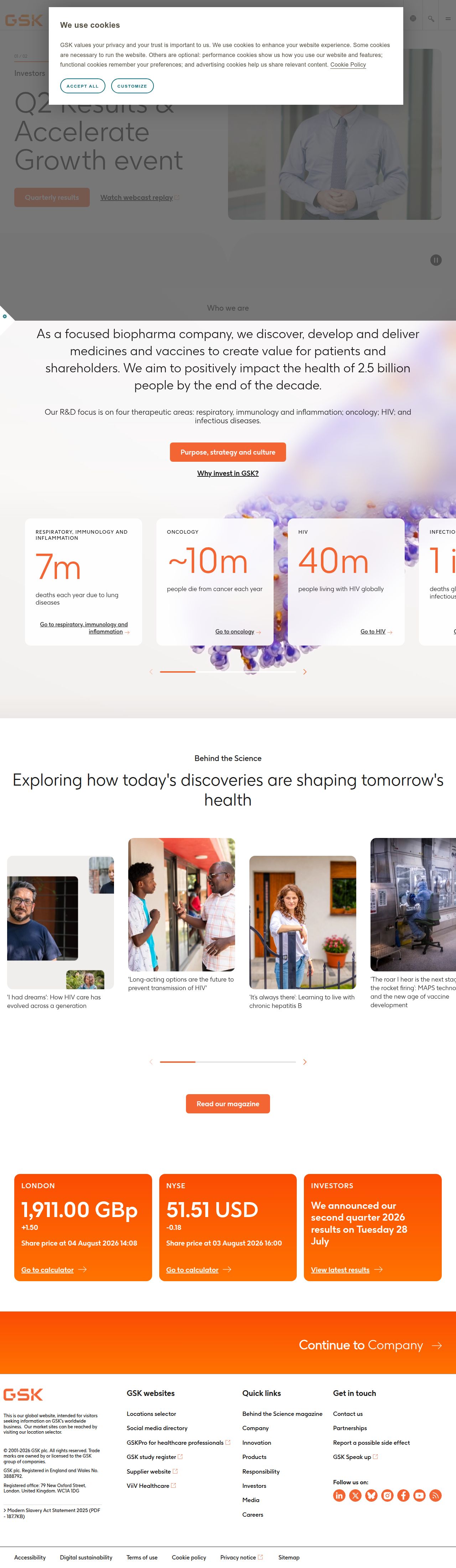
The read
The company
Positioning
GSK is a global biopharma leader that unites science, technology, and talent to get ahead of disease together. They serve healthcare professionals, patients, and investors through innovative medical and pharmaceutical advancements. By combining cutting-edge scientific research with human capability, GSK aims to deliver impactful global health solutions at scale.
Who it is for
Healthcare professionals, patients, investors, and global health partners
Values
Scientific innovationCollaborative impactHealth equityTechnological integrationLook and feel
Rounded corners, spacious layout, gradients, clinical, modern.
Reads as
clinicalmodernhumancorporatevibrantRecurring motifs
orange indicator barssubtle microscopic background overlayspill-shaped pill buttons- Theme
- light
- Corners
- rounded
- Density
- spacious
- Borders
- none
- Shadows
- subtle
- Gradients
- yes
- Icons
- outlined
- Illustration
- none
- Photography
- full-color
- Imagery shows
- medical professionals, patients in daily settings, lab environments, microscopic cellular imagery
- Imagery composition
- portrait orientation, medium shots, natural lighting, soft background blur
- Imagery grading
- naturalistic, warm skin tones, high clarity
Motion
Deliberate scroll-driven reveals where content sections fade and translate into view to maintain structured narrative flow.
Signature effects
scroll-triggered fade transitionssmooth multi-slide content carouselsLibraries detected
aosswiper- Intensity
- subtle
- Speed
- moderate
- Easing
- linear progression paired with structured timing
- Scroll animations
- yes
- Hover effects
- no
- Honours reduced motion
- no
Voice
The voice reads professional, authoritative, purposeful, optimistic.
Tone
professionalauthoritativepurposefuloptimisticVoice
expertcollaborativeinstitutionalclearWords it uses
unite scienceget ahead of diseasetechnology and talenthealthcare professionalsWords it avoids
cheapmiracle curedisruptive techquick fix- Calls to action
- Direct and functional actions paired with clear destinations like 'Contact us' or audience segmentations.
- Headline case
- sentence
- hero headline
- Purpose-driven, bold, and inspiring
- navigation and utility
- Functional, direct, and accessible
- investor surface
- Institutional, transparent, and authoritative
The recordwhat we measured, and how sure we are
How the brand reads
GSK is a global biopharmaceuticals company that researches, develops, and manufactures vaccines and specialty medicines to prevent and treat diseases.
Known for
Global vaccine distributionPharmaceutical research and developmentBiotech innovationDesign personality
Clean, light-mode corporate presentation defined by light gray backdrops and crisp orange brand accents.
Design conventions
Light neutral backgrounds with bold orange call-outsClear segment navigation for professional and investor audiencesAccessible corporate structural layoutWriting style
Purpose-driven declarative statements using active verbs like 'unite' and 'get ahead' framed around collective action and collaboration.
Audience, inferred
Healthcare professionals, investors, researchers, and global health stakeholders
Values, inferred
Scientific innovationCollaborative impactHealth equityTechnological integrationApplying the brand
Use a clean light-mode theme with light gray backgrounds (#F8F7F7) and rich dark gray typography (#262626). Incorporate vibrant orange (#FD5E02) selectively for key highlights, metrics, and callouts to reflect the corporate visual identity.
Spacing and accessibility
- Base unit
- 8px
- Scale
- 0.5 · 1 · 2 · 3 · 4 · 6 · 8
- Content margin
- 24px
- Contrast target
- AAA
- Minimum font size
- 16px
- Colourblind safe
- yes
How this was read
- Platform
- Generic
- Overall confidence
- 0.77
- Font confidence
- 1.00
- Schema version
- v2
The score was built from
Logo found (jsonld-org)Primary color extractedSecondary color extractedFonts found: GSK regular, GSK lightCompany name found: GSKNothing could fill
contrast_violationConfidence is 0 to 1 — a low score is reported, never hidden. Set a floor in your own code and fall back to your defaults below it, rather than shipping the raw score as certainty.
Read something wrong? Sample it again — this page follows within 15 minutes.
Confidence per field · 19 fields
- description
- 0.00
- industry
- 0.00
- tagline
- 0.00
- accessibility.contrast_target
- 0.30
- contrast
- 0.30
- audience
- 0.85
- brand_intelligence
- 0.85
- colors
- 0.85
- copywriting
- 0.85
- font_availability
- 0.85
- fonts
- 0.85
- logo_description
- 0.85
- motion
- 0.85
- name
- 0.85
- positioning_statement
- 0.85
- tone
- 0.85
- values
- 0.85
- visual_style
- 0.85
- voice
- 0.85
Get this as JSON
GET /v1/brands/gsk.com
curl https://api.extractbrand.dev/v1/brands/gsk.com \
-H "Authorization: Bearer YOUR_API_KEY"Sampled from gsk.com on . Own this brand? Claim it or report this page.