
Confidence is 0 to 1 — a low score is reported, never hidden. Set a floor in your own code and fall back to your defaults below it, rather than shipping the raw score as certainty.
The kit
Brand colours
Click a colour to copy its hex.
Also on the page · 5 colours
Fonts
- Headline case
- none
- Headline tracking
- normal
- Headline weight
- regular
Logo
The Google wordmark features custom sans-serif typography in four distinct primary/secondary colors (blue, red, yellow, green) with a friendly, geometric construction.
Sampled from the mark
- Source
- inline-svg
- Lightness
- 0.35
- Transparent
- yes
The page we read
The capture every value above was read from. Its top, at readable scale.
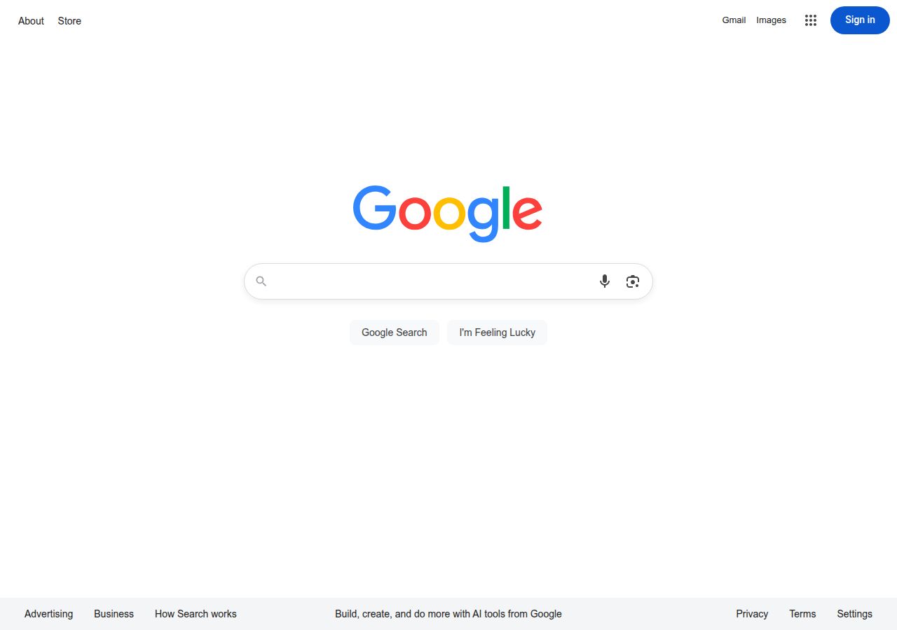
The read
The company
Positioning
Google provides a universal gateway to organise the world's information and make it universally accessible and useful. Serving global everyday internet users, researchers, and enterprises, the platform connects people with answers instantly. Its minimalist interface focuses entirely on user intent, speed, and seamless access across digital services.
Who it is for
Global internet users, consumers, students, businesses, and developers seeking search and digital tools.
Values
AccessibilitySimplicityUser FocusEfficiencyLook and feel
Pill corners, spacious layout, minimalist, functional.
Reads as
minimalistfunctionaliconicairyutility-focusedRecurring motifs
pill-shaped search barrounded action buttonsneutral footer panel- Theme
- light
- Corners
- pill
- Density
- spacious
- Borders
- solid
- Shadows
- subtle
- Gradients
- no
- Icons
- outlined
- Illustration
- none
Motion
Subtle, functional transitions that support effortless user interaction through smooth fades and brief easing.
Signature effects
350ms to 500ms smooth state transitionssubtle element fades and focus shifts- Intensity
- subtle
- Speed
- fast
- Easing
- standard material easing via cubic-bezier(0.4, 0, 0.2, 1)
- Scroll animations
- no
- Hover effects
- no
- Honours reduced motion
- no
Voice
The voice reads Helpful, Direct, Minimal, Neutral.
Tone
HelpfulDirectMinimalNeutralVoice
ClearObjectiveUnpretentiousWords it uses
SearchGoogleContinuePrivacyTermsWords it avoids
ComplicatedJargonSalesyAggressive- Calls to action
- Clear, functional, and action-oriented verbs.
- Headline case
- sentence
- hero headline
- Direct and plainspoken, focusing on immediate task navigation.
- CTA
- Functional and clear, using direct imperative phrasing.
The recordwhat we measured, and how sure we are
How the brand reads
Google is a global technology company providing search engine infrastructure, digital software tools, and cloud services.
Known for
Search engine technologyMinimalist homepage interfaceUniversal information accessibilityDesign personality
Ultra-minimalist, clean, and utilitarian with a light-mode layout dominated by high contrast and spacious white background surfaces.
Design conventions
Dominant white canvas with dark primary textMinimal decoration prioritizing core task functionalityStandardized accessible typography and clear functional CTAsWriting style
Short, direct sentence structures with plain-language terms focused entirely on functionality and clarity.
Audience, inferred
Global internet users seeking fast, reliable information search and digital services.
Values, inferred
AccessibilitySimplicityUser FocusEfficiencyApplying the brand
Use a stark, light-mode background (#FEFEFF) with high-contrast neutral text (#1F1F1F) and occasional primary blue accents (#1A0DAB). Keep layouts extremely spacious, clutter-free, and straightforward.
Spacing and accessibility
- Base unit
- 8px
- Scale
- 0.5 · 1 · 2 · 3 · 4 · 6 · 8
- Content margin
- 24px
- Contrast target
- AAA
- Minimum font size
- 16px
- Colourblind safe
- yes
How this was read
- Platform
- Generic
- Overall confidence
- 0.63
- Font confidence
- 1.00
- Schema version
- v2
The score was built from
Logo not foundPrimary color extractedSecondary color extractedFonts found: Google SansCompany name found: GoogleNothing could fill
font_availabilityConfidence is 0 to 1 — a low score is reported, never hidden. Set a floor in your own code and fall back to your defaults below it, rather than shipping the raw score as certainty.
Read something wrong? Sample it again — this page follows within 15 minutes.
Confidence per field · 19 fields
- description
- 0.00
- industry
- 0.00
- tagline
- 0.00
- font_availability
- 0.30
- accessibility.contrast_target
- 0.85
- audience
- 0.85
- brand_intelligence
- 0.85
- colors
- 0.85
- contrast
- 0.85
- copywriting
- 0.85
- fonts
- 0.85
- logo_description
- 0.85
- motion
- 0.85
- name
- 0.85
- positioning_statement
- 0.85
- tone
- 0.85
- values
- 0.85
- visual_style
- 0.85
- voice
- 0.85
Get this as JSON
GET /v1/brands/google.com
curl https://api.extractbrand.dev/v1/brands/google.com \
-H "Authorization: Bearer YOUR_API_KEY"Sampled from google.com on . Own this brand? Claim it or report this page.