Fern Expo
Confidence is 0 to 1 — a low score is reported, never hidden. Set a floor in your own code and fall back to your defaults below it, rather than shipping the raw score as certainty.
The kit
Brand colours
Click a colour to copy its hex.
Fonts
Headline setting
Fern Expo
Set in our own face at their measurements — this page loads no brand fonts.
- Headline case
- uppercase
- Headline tracking
- normal
- Headline weight
- bold
Logo
 on light
A lowercase sans-serif wordmark reading 'fern' in green, accompanied by 'an Nth Degree company' in a small secondary line beneath it.
Sampled from the mark
- Source
- jsonld-org
- Lightness
- 0.88
- Transparent
- no
- Plate colour
- #ffffff
The page we read
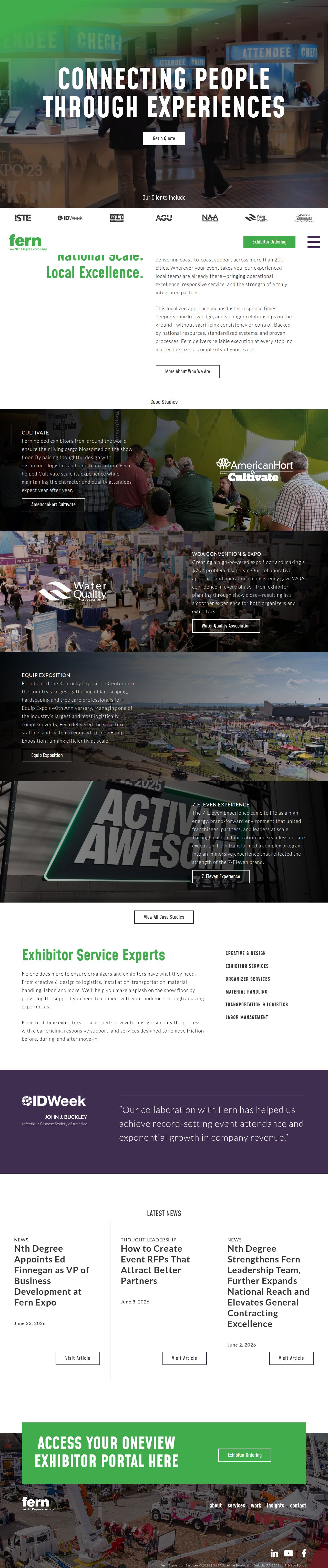
The capture every value above was read from. Its top, at readable scale.
The read
The company
Positioning
Fern Expo provides comprehensive trade show and exhibition management services, helping organizations design and execute impactful event environments. They serve event organizers, exhibitors, and corporate brands seeking seamless show production. Through an integrated mix of creative design, logistics, labor management, and exhibitor support, Fern Expo transforms physical spaces into engaging face-to-face connection hubs.
Who it is for
Event organizers, trade show planners, exhibit managers, and corporate exhibitors
Values
Excellence in ExecutionCustomer CentricityReliabilitySeamless ConnectionLook and feel
Sharp corners, balanced layout, corporate, experiential.
Reads as
corporateexperientialprofessionalboldstructuredRecurring motifs
thin grey vertical dividing rulesclient logo carouselsoutline button borders- Theme
- light
- Corners
- sharp
- Density
- balanced
- Borders
- solid
- Shadows
- none
- Gradients
- no
- Illustration
- none
- Photography
- full-color
- Imagery shows
- busy trade show floors, exhibition booths, event signage, venue spaces, people attending expos
- Imagery composition
- full-width banner strips, layered text overlays on dimmed imagery, wide architectural event shots
- Imagery grading
- naturalistic with darkened overlays for text readability
Motion
Deliberate scroll-triggered reveals where content containers fade in and slide vertically into place over moderate durations.
Signature effects
Scroll-triggered fade and slide-up on layout columnsSmooth transform transitions on carousel stagesLibraries detected
aos- Intensity
- subtle
- Speed
- moderate
- Easing
- Smooth ease-out curves
- Scroll animations
- yes
- Hover effects
- yes
- Honours reduced motion
- no
Voice
The voice reads Professional, Capable, Inviting, Direct.
Tone
ProfessionalCapableInvitingDirectVoice
AuthoritativeService-orientedClearWords it uses
Connecting PeopleExperiencesExhibitor ServicesTransportation & LogisticsLabor & ManagementWords it avoids
CheapDIYDisruptiveSelf-service- Calls to action
- Direct action-oriented verbs or direct navigation labels like Contact and Insights
- Headline case
- title
- hero headline
- Warm, connection-focused, and aspirational
- service descriptions
- Pragmatic, clear, and reassuringly professional
The recordwhat we measured, and how sure we are
How the brand reads
Fern Expo delivers end-to-end trade show and exhibitor services, including event design, logistics, labor, and management.
Known for
Trade show logisticsExhibitor servicesEvent management and laborDesign personality
Professional and structured light-mode layout grounded by crisp neutral surfaces and vibrant green accent highlights.
Design conventions
Clear navigation bar with top-level service categoriesCorporate light background with dark typographyActionable green CTA buttonsWriting style
Clear, concise, and professional focus on human connection and operational expertise.
Audience, inferred
Trade show directors, corporate marketing leads, and event production managers
Values, inferred
Excellence in ExecutionCustomer CentricityReliabilitySeamless ConnectionApplying the brand
Maintain a clean light-mode visual layout utilizing off-white backgrounds (#FCFCFC) paired with dark charcoal body copy (#3D3938) and bright green accents (#41AC4C) for key takeaways or buttons. Avoid heavy dark-mode backgrounds.
Spacing and accessibility
- Base unit
- 8px
- Scale
- 0.5 · 1 · 2 · 3 · 4 · 6 · 8
- Content margin
- 24px
- Contrast target
- AAA
- Minimum font size
- 16px
- Colourblind safe
- yes
How this was read
- Platform
- WordPress
- Overall confidence
- 0.77
- Font confidence
- 1.00
- Schema version
- v2
The score was built from
Logo found (jsonld-org)Primary color extractedSecondary color extractedFonts found: Mohave, LatoCompany name found: Fern ExpoConfidence is 0 to 1 — a low score is reported, never hidden. Set a floor in your own code and fall back to your defaults below it, rather than shipping the raw score as certainty.
Read something wrong? Sample it again — this page follows within 15 minutes.
Confidence per field · 23 fields
- description
- 0.00
- industry
- 0.00
- tagline
- 0.00
- accessibility.contrast_target
- 0.85
- audience
- 0.85
- background
- 0.85
- brand_intelligence
- 0.85
- contrast
- 0.85
- copywriting
- 0.85
- font_availability
- 0.85
- fonts
- 0.85
- logo_description
- 0.85
- motion
- 0.85
- name
- 0.85
- palette
- 0.85
- positioning_statement
- 0.85
- primary
- 0.85
- secondary
- 0.85
- text
- 0.85
- tone
- 0.85
- values
- 0.85
- visual_style
- 0.85
- voice
- 0.85
Get this as JSON
GET /v1/brands/fernexpo.com
curl https://api.extractbrand.dev/v1/brands/fernexpo.com \
-H "Authorization: Bearer YOUR_API_KEY"Sampled from fernexpo.com on . Own this brand? Claim it or report this page.