English language
Confidence is 0 to 1 — a low score is reported, never hidden. Set a floor in your own code and fall back to your defaults below it, rather than shipping the raw score as certainty.
The kit
Brand colours
Click a colour to copy its hex.
Fonts
Headline setting
English language
Set in our own face at their measurements — this page loads no brand fonts.
- Headline case
- uppercase
- Headline tracking
- wide
- Headline weight
- regular
Logo
The logo features a colorful isometric 3D cube mark composed of vibrant cyan, magenta, and yellow faces next to the sans-serif text 'DG DIMENSE' with a tagline 'A Roland DG Group Company'.
Sampled from the mark
- Source
- body-img
- Lightness
- 0.02
- Transparent
- no
- Plate colour
- #000000
The page we read
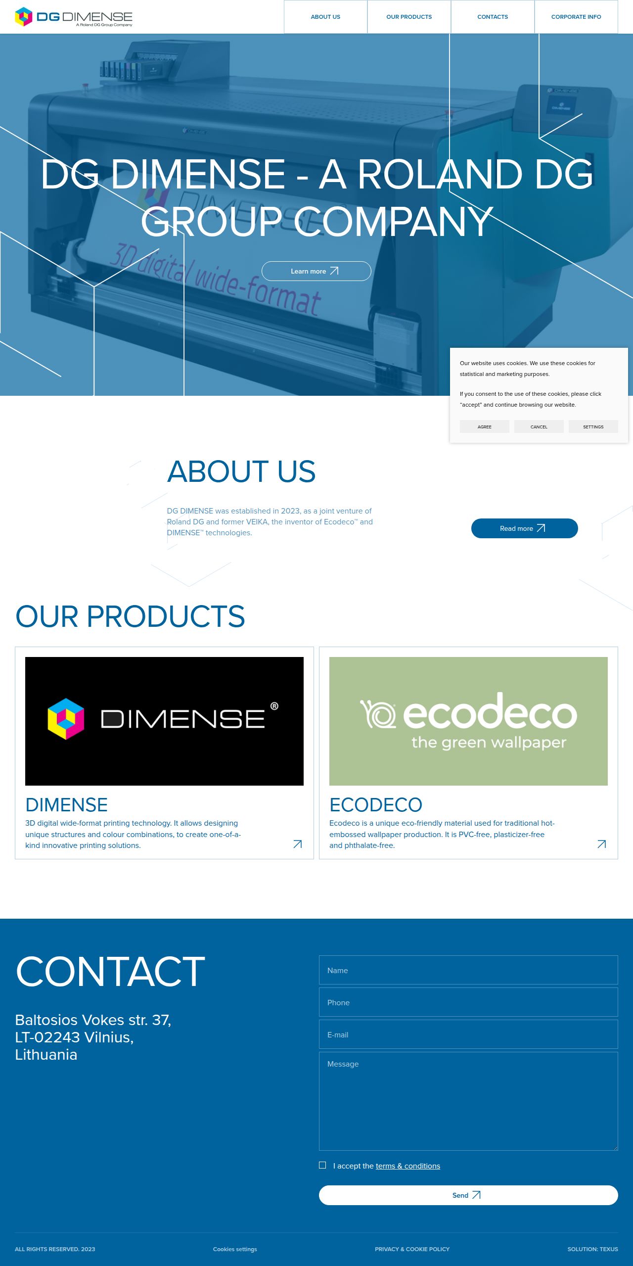
The capture every value above was read from. Its top, at readable scale.
The read
The company
Positioning
DG DIMENSE, a Roland DG Group Company, provides innovative digital printing and relief decoration technologies including Dimense and Ecodeco solutions. Serving commercial printing, interior decor, and industrial partners, the company delivers specialized 3D textured printing systems. DG DIMENSE sets itself apart through eco-friendly materials and proprietary dimensional printing technology backed by Roland DG's global enterprise footprint.
Who it is for
Commercial print providers, wall covering manufacturers, interior designers, and industrial packaging professionals.
Values
InnovationSustainabilityQualityPrecisionLook and feel
Sharp corners, spacious layout, corporate, industrial.
Reads as
corporateindustrialgeometrictechnicalcleanRecurring motifs
white geometric wireframe cube outlinesthin structural grid linesthin border dividers- Theme
- light
- Corners
- sharp
- Density
- spacious
- Borders
- solid
- Shadows
- none
- Gradients
- no
- Illustration
- geometric
- Photography
- full-color
- Imagery shows
- large-format industrial printing machinery, brand technology logos
- Imagery composition
- hero header shot of industrial hardware with geometric line overlays
- Imagery grading
- cool blue-tinted overlay on hero shot
Motion
Functional and measured, featuring linear vector path drawing over up to 4000ms and smooth 1000ms expansion reveals for utility containers.
Signature effects
Linear stroke-dashoffset vector path drawing1000ms container expansion and position revealLibraries detected
gsapaosswiperlenis- Intensity
- subtle
- Speed
- slow
- Easing
- Linear and smooth standard ease curves
- Scroll animations
- yes
- Hover effects
- yes
- Honours reduced motion
- no
Voice
The voice reads Professional, Corporate, Technical, Direct.
Tone
ProfessionalCorporateTechnicalDirectVoice
AuthoritativeClearInformativeWords it uses
DimenseEcodecoRoland DG GroupProductsCorporate infoWords it avoids
RevolutionaryDisruptiveCheapGimmick- Calls to action
- Simple, direct navigational statements such as 'About us' or 'Contacts'.
- Headline case
- title
- hero headline
- Corporate and authoritative with direct brand affiliation.
- navigation
- Functional, concise, and structured.
The recordwhat we measured, and how sure we are
How the brand reads
DG DIMENSE, part of the Roland DG Group, develops 3D textured printing technologies and eco-friendly wallcovering materials for commercial decor and print industries.
Known for
Dimensional 3D printingDimense texture systemsEcodeco eco-friendly decor solutionsRoland DG corporate affiliationDesign personality
Clean, structured, light-mode corporate aesthetic dominated by primary tech blues (#01639E, #4E92BA) against crisp neutral backgrounds (#FDFEFE).
Design conventions
Clean neutral light background surfacesStrong corporate blue primary accentsClear top-level section navigationMinimalist functional layoutWriting style
Direct, minimal, and corporate with clear noun-focused headers.
Audience, inferred
B2B commercial printers, interior decor manufacturers, and industrial print specialists.
Values, inferred
InnovationSustainabilityQualityPrecisionApplying the brand
Use a crisp light theme with #FDFEFE as the primary background color. Implement #01639E as the dominant brand color for headers, key callouts, and key structural elements. Incorporate softer blue tones (#4E92BA, #2A75A0) for data visuals or secondary graphics, keeping typography clear, professional, and well-spaced.
Spacing and accessibility
- Base unit
- 8px
- Scale
- 0.5 · 1 · 2 · 3 · 4 · 6 · 8
- Content margin
- 24px
- Contrast target
- AAA
- Minimum font size
- 16px
- Colourblind safe
- yes
How this was read
- Platform
- Generic
- Overall confidence
- 0.57
- Font confidence
- 0.50
- Schema version
- v2
The score was built from
Logo found (body-img)Primary color extractedSecondary color extractedFonts found: proxima novaCompany name found: English languageNothing could fill
font_availabilityConfidence is 0 to 1 — a low score is reported, never hidden. Set a floor in your own code and fall back to your defaults below it, rather than shipping the raw score as certainty.
Read something wrong? Sample it again — this page follows within 15 minutes.
Confidence per field · 23 fields
- description
- 0.00
- industry
- 0.00
- tagline
- 0.00
- font_availability
- 0.30
- accessibility.contrast_target
- 0.85
- audience
- 0.85
- background
- 0.85
- brand_intelligence
- 0.85
- contrast
- 0.85
- copywriting
- 0.85
- fonts
- 0.85
- logo_description
- 0.85
- motion
- 0.85
- name
- 0.85
- palette
- 0.85
- positioning_statement
- 0.85
- primary
- 0.85
- secondary
- 0.85
- text
- 0.85
- tone
- 0.85
- values
- 0.85
- visual_style
- 0.85
- voice
- 0.85
Get this as JSON
GET /v1/brands/dgdimense.com
curl https://api.extractbrand.dev/v1/brands/dgdimense.com \
-H "Authorization: Bearer YOUR_API_KEY"Sampled from dgdimense.com on . Own this brand? Claim it or report this page.