
ColourPop
Confidence is 0 to 1 — a low score is reported, never hidden. Set a floor in your own code and fall back to your defaults below it, rather than shipping the raw score as certainty.
The kit
Brand colours
Click a colour to copy its hex.
Also on the page · 2 colours
Fonts
Headline setting
ColourPop
Set in our own face at their measurements — this page loads no brand fonts.
- Headline case
- uppercase
- Headline tracking
- normal
- Headline weight
- bold
Logo
The ColourPop logo features hand-drawn, informal lettering rendered in a charcoal or dark brown script style, conveying a personal, DIY sensibility that mirrors the brand's accessible beauty philosophy.
Sampled from the mark
- Source
- header-img
- Lightness
- 0.00
- Transparent
- yes
The page we read
The capture every value above was read from. Its top, at readable scale.
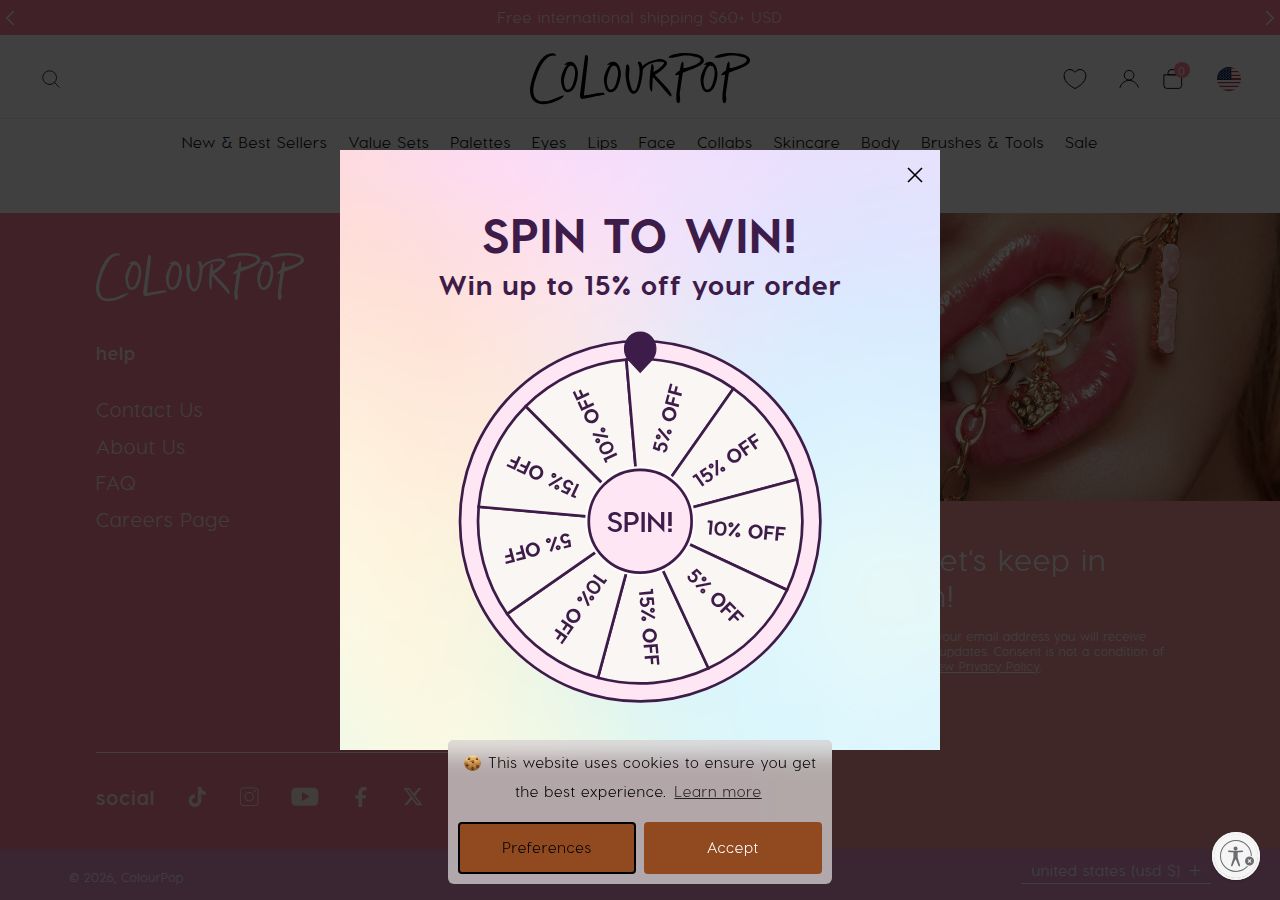
The read
The company
Positioning
ColourPop is an affordable, trend-driven cosmetics brand that makes high-quality makeup and innovative formulations accessible to a playful, creative audience. The brand serves makeup enthusiasts aged 16–35 who value both quality and cultural relevance, delivering signature products like Super Shock Shadow alongside celebrity collaborations. ColourPop differentiates through accessible pricing, bold colour innovation, and a youthful, contemporary brand voice that balances sophistication with fun.
Who it is for
Beauty enthusiasts and makeup consumers seeking affordable, trend-driven cosmetics with playful, accessible appeal
Values
AccessibilityCreativityInclusivityQualityPlayfulnessLook and feel
Rounded corners, balanced layout, gradients, playful, whimsical.
Reads as
playfulwhimsicalyouthfulpastel-drivenhandcraftedRecurring motifs
pastel gradient fills (peach to lavender to blue)soft geometric sectionsrounded wheel illustration with manual line work- Theme
- light
- Corners
- rounded
- Density
- balanced
- Borders
- solid
- Shadows
- subtle
- Gradients
- yes
- Icons
- outlined
- Illustration
- hand-drawn
- Photography
- full-color
- Imagery shows
- beauty products (jewelry, chains, makeup items), lifestyle and lifestyle-adjacent flat lays
- Imagery composition
- full-bleed hero imagery, close-up product detail shots with shallow depth
- Imagery grading
- warm, slightly desaturated, nostalgic
Motion
Understated, purposeful animation: quick hover transitions on interactive elements (150–200ms), carousel transitions via swiper (likely 300–400ms), and occasional longer ambient effects (1400–4000ms) for background or hero elements. Motion enhances usability rather than dominating attention, keeping the sophisticated dark aesthetic intact.
Signature effects
Hover lift or state-change on product cards (150–200ms ease-in-out)Carousel slide transitions (swiper library, ~300–400ms)Background or ambient loop animations (1400–4000ms linear or ease-in-out)Libraries detected
swiper- Intensity
- subtle
- Speed
- fast
- Easing
- Mixed timing functions with moderate appeal: ease-in-out for smooth, predictable motion; cubic-bezier(.4,0,.2,1) for material-design-aligned custom curves; linear for consistent, mechanical effects. Durations range from snappy (150–200ms) to leisurely (1400–4000ms).
- Scroll animations
- no
- Hover effects
- yes
- Honours reduced motion
- no
Voice
The voice reads playful, modern, accessible, sophisticated.
Tone
playfulmodernaccessiblesophisticatedtrendyVoice
approachableenergetictrend-awareaspirationaldirectWords it uses
Super Shock Shadowtop-ratediconic collabsglossy balms & linersFind your matchshop nowtrendingcolourWords it avoids
GenericOrdinaryBoringProfessionalCorporate speak- Calls to action
- Imperative, benefit-forward, urgency-oriented: 'Shop now!', 'Find your match'. CTAs are concise, action-packed, and consumer-focused.
- Headline case
- sentence
- Meta description / hero CTA
- Energetic, benefit-driven, and playful—emphasis on product innovation and accessibility
- Product copy
- Descriptive and aspirational, focusing on quality, formula benefits, and exclusivity
The recordwhat we measured, and how sure we are
How the brand reads
ColourPop is an e-commerce cosmetics brand offering affordable, trend-forward makeup across eyes, lips, and face categories, known for innovative formulations like Super Shock Shadow and frequent celebrity collaborations.
Known for
Super Shock Shadow formulaAffordable price pointsCelebrity and influencer collaborationsPlayful colour palettesHigh-pigment formulationsDesign personality
Bold, playful, and modern with a dark, sophisticated edge. The dark chocolate and charcoal base creates luxury perception while pastel accent colours (blush pink, lavender, cream, peach) inject fun and approachability. Feels contemporary, youthful, and trend-aware without sacrificing quality signals.
Design conventions
Dark-mode e-commerce layoutAccent colour hierarchy using warm and cool pastels against dark backgroundsProduct-focused grid presentationCTA-driven conversion designWriting style
Direct, action-oriented, and conversational. Copy uses imperative voice ('Shop now!', 'Find your match') and emphasizes product innovation and exclusivity ('top-rated', 'iconic collabs'). Sentences are short and benefit-focused, designed for scanning. Tone balances accessibility with aspiration.
Audience, inferred
Budget-conscious to mid-range makeup consumers aged 16–35, particularly those who value trend-driven products, celebrity collabs, and creative colour expression; includes makeup enthusiasts and social-media-savvy beauty consumers.
Values, inferred
AccessibilityCreativityInclusivityQualityPlayfulnessApplying the brand
Use the dark-mode palette: apply #3F2328 or #3F3E3E as primary backgrounds. Accent with pastel highlights—blush pink (#FF849E), lavender (#E3E6FC), cream (#F9F7E2), or peachy tones (#FEEBDC)—to draw attention to key messages. Typography should contrast sharply against dark surfaces. Embrace playful, modern layouts; avoid corporate formality. Product showcases and CTA buttons benefit from the warm-cool pastel contrast. Keep motion subtle and purposeful to maintain sophistication.
Spacing and accessibility
- Base unit
- 8px
- Scale
- 0.5 · 1 · 2 · 3 · 4 · 6 · 8
- Content margin
- 24px
- Contrast target
- AAA
- Minimum font size
- 16px
- Colourblind safe
- yes
How this was read
- Platform
- Shopify
- Overall confidence
- 0.74
- Font confidence
- 0.50
- Schema version
- v2
The score was built from
Logo found (header-img)Primary color extractedSecondary color extractedFonts found: Visby, ui sans serifCompany name found: ColourPopNothing could fill
font_availabilityConfidence is 0 to 1 — a low score is reported, never hidden. Set a floor in your own code and fall back to your defaults below it, rather than shipping the raw score as certainty.
Read something wrong? Sample it again — this page follows within 15 minutes.
Confidence per field · 19 fields
- description
- 0.00
- industry
- 0.00
- tagline
- 0.00
- font_availability
- 0.30
- accessibility.contrast_target
- 0.85
- audience
- 0.85
- brand_intelligence
- 0.85
- colors
- 0.85
- contrast
- 0.85
- copywriting
- 0.85
- fonts
- 0.85
- logo_description
- 0.85
- motion
- 0.85
- name
- 0.85
- positioning_statement
- 0.85
- tone
- 0.85
- values
- 0.85
- visual_style
- 0.85
- voice
- 0.85
Get this as JSON
GET /v1/brands/colourpop.com
curl https://api.extractbrand.dev/v1/brands/colourpop.com \
-H "Authorization: Bearer YOUR_API_KEY"Sampled from colourpop.com on . Own this brand? Claim it or report this page.