
Capital One
Confidence is 0 to 1 — a low score is reported, never hidden. Set a floor in your own code and fall back to your defaults below it, rather than shipping the raw score as certainty.
The kit
Brand colours
Click a colour to copy its hex.
Fonts
- Headline case
- none
- Headline tracking
- normal
- Headline weight
- light
Logo
The Capital One logo features stylized navy serif-influenced text paired with a red swoosh/arc sweeping over the top right.
- Source
- header-img
- Transparent
- no
The page we read
The capture every value above was read from. Its top, at readable scale.
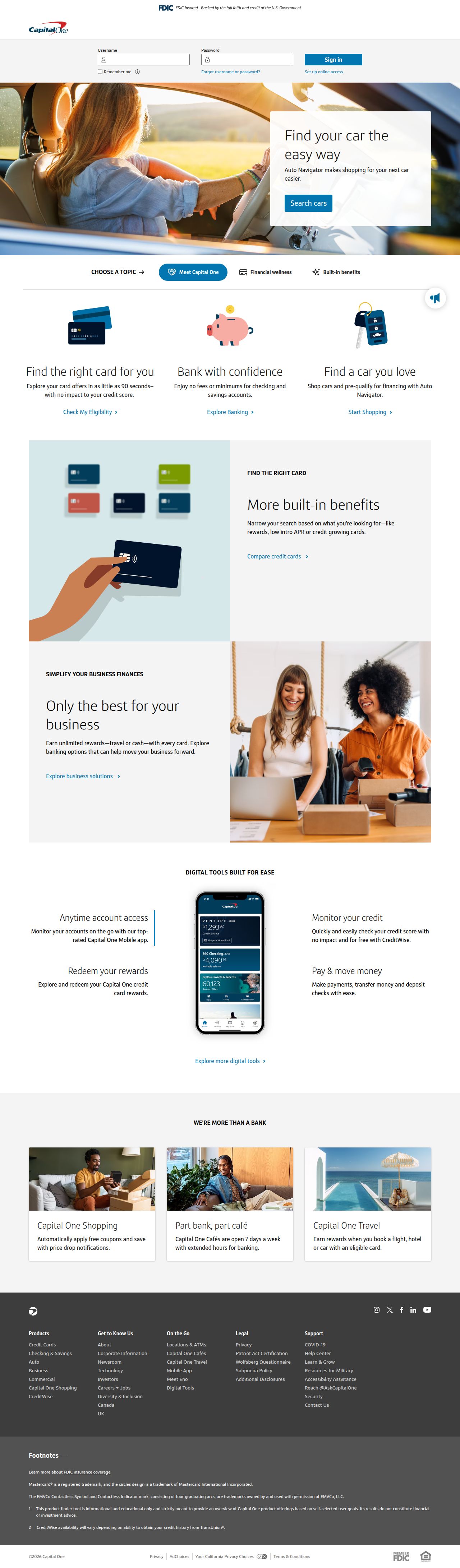
The read
The company
Positioning
Capital One exists to help everyday consumers and businesses manage and grow their money through accessible financial products. They serve individuals seeking credit cards, checking and savings accounts, and auto loans. Capital One sets itself apart by pairing modern digital banking tools with flexible products designed to meet diverse financial goals.
Who it is for
Consumers and small business owners looking for accessible banking, credit cards, auto financing, and savings solutions.
Values
AccessibilityEmpowermentFinancial Well-beingClarityLook and feel
Rounded corners, balanced layout, corporate, approachable.
Reads as
corporateapproachablecleanconsumer-friendlystructuredRecurring motifs
uppercase section category labelswhite card containers on light grey background sectionshorizontal divider rules- Theme
- light
- Corners
- rounded
- Density
- balanced
- Borders
- solid
- Shadows
- subtle
- Gradients
- no
- Icons
- outlined
- Illustration
- flat
- Photography
- full-color
- Imagery shows
- people using mobile banking apps, small business owners in a boutique, lifestyle scenes of driving and travel
- Imagery composition
- shallow depth of field, natural lighting, medium shots of people engaged with technology or business
- Imagery grading
- bright, natural, warm skin tones with balanced contrast
Motion
Snappy and responsive interactions feature fast scale and hover transitions to give interface elements immediate feel.
Signature effects
interactive card hover liftssnappy button state transitionssmooth content expansion routines- Intensity
- subtle
- Speed
- fast
- Easing
- custom cubic-bezier curves with subtle spring overshoots and smooth ease-in-out transitions
- Scroll animations
- no
- Hover effects
- yes
- Honours reduced motion
- no
Voice
The voice reads Approachable, Clear, Helpful, Direct.
Tone
ApproachableClearHelpfulDirectVoice
GuidingPracticalEncouragingWords it uses
Financial goalsBankingExploreCredit cardsAuto loansWords it avoids
Jargon-heavy financial phrasingComplex fine print languageElitist wealth management terms- Calls to action
- Action-oriented and direct, encouraging discovery using verbs like 'Explore' and 'Learn'.
- Headline case
- title
- hero headline
- Direct and action-oriented encouraging product exploration
- meta description
- Supportive and outcome-focused on customer goals
The recordwhat we measured, and how sure we are
How the brand reads
Capital One is a major American financial services company offering personal banking, credit cards, auto loans, and savings products. They focus on delivering user-friendly digital tools to simplify financial management.
Known for
Venture and Quicksilver credit cardsHigh-yield savings and checking accountsAuto financing solutionsWhat's in your wallet? advertising campaignDesign personality
Clean, structured, and modern light-mode layout dominated by crisp light gray surfaces (#FAFAFA) paired with deep trustworthy blue accent colors.
Design conventions
Light neutral backgrounds with high-contrast slate textDistinct primary action blue (#0276B1) for key calls to actionClean modular card grid systems for financial productsWriting style
Uses direct, plain-English statements focused on user goals, avoiding heavy financial jargon in favor of clear action verbs.
Audience, inferred
General financial consumers, drivers financing vehicles, credit card users, and personal savers.
Values, inferred
AccessibilityFinancial EmpowermentClarityReliabilityApplying the brand
Design slides in a clean light mode with background tone #FAFAFA. Use dark charcoal (#474747 or #343432) for primary readable text, and reserve deep corporate blues (#0276B1, #0C4A69) for key highlights, headers, and callout containers.
Spacing and accessibility
- Base unit
- 8px
- Scale
- 0.5 · 1 · 2 · 3 · 4 · 6 · 8
- Content margin
- 24px
- Contrast target
- AAA
- Minimum font size
- 16px
- Colourblind safe
- yes
How this was read
- Platform
- Generic
- Overall confidence
- 0.94
- Font confidence
- 1.00
- Schema version
- v2
The score was built from
Logo found (header-img)Primary color extractedSecondary color extractedFonts found: OptimistCompany name found: Capital OneConfidence is 0 to 1 — a low score is reported, never hidden. Set a floor in your own code and fall back to your defaults below it, rather than shipping the raw score as certainty.
Read something wrong? Sample it again — this page follows within 15 minutes.
Confidence per field · 23 fields
- description
- 0.00
- industry
- 0.00
- tagline
- 0.00
- accessibility.contrast_target
- 0.85
- audience
- 0.85
- background
- 0.85
- brand_intelligence
- 0.85
- contrast
- 0.85
- copywriting
- 0.85
- font_availability
- 0.85
- fonts
- 0.85
- logo_description
- 0.85
- motion
- 0.85
- name
- 0.85
- palette
- 0.85
- positioning_statement
- 0.85
- primary
- 0.85
- secondary
- 0.85
- text
- 0.85
- tone
- 0.85
- values
- 0.85
- visual_style
- 0.85
- voice
- 0.85
Get this as JSON
GET /v1/brands/capitalone.com
curl https://api.extractbrand.dev/v1/brands/capitalone.com \
-H "Authorization: Bearer YOUR_API_KEY"Sampled from capitalone.com on . Own this brand? Claim it or report this page.