
Broadcom Inc.
Confidence is 0 to 1 — a low score is reported, never hidden. Set a floor in your own code and fall back to your defaults below it, rather than shipping the raw score as certainty.
The kit
Brand colours
Click a colour to copy its hex.
Also on the page · 7 colours
Fonts
- Headline case
- none
- Headline tracking
- normal
- Headline weight
- bold
Logo
A red wave-like mark featuring a stylized geometric shape alongside the uppercase typography 'BROADCOM'.
Sampled from the mark
- Source
- favicon
- Lightness
- 0.24
- Transparent
- yes
The page we read
The capture every value above was read from. Its top, at readable scale.
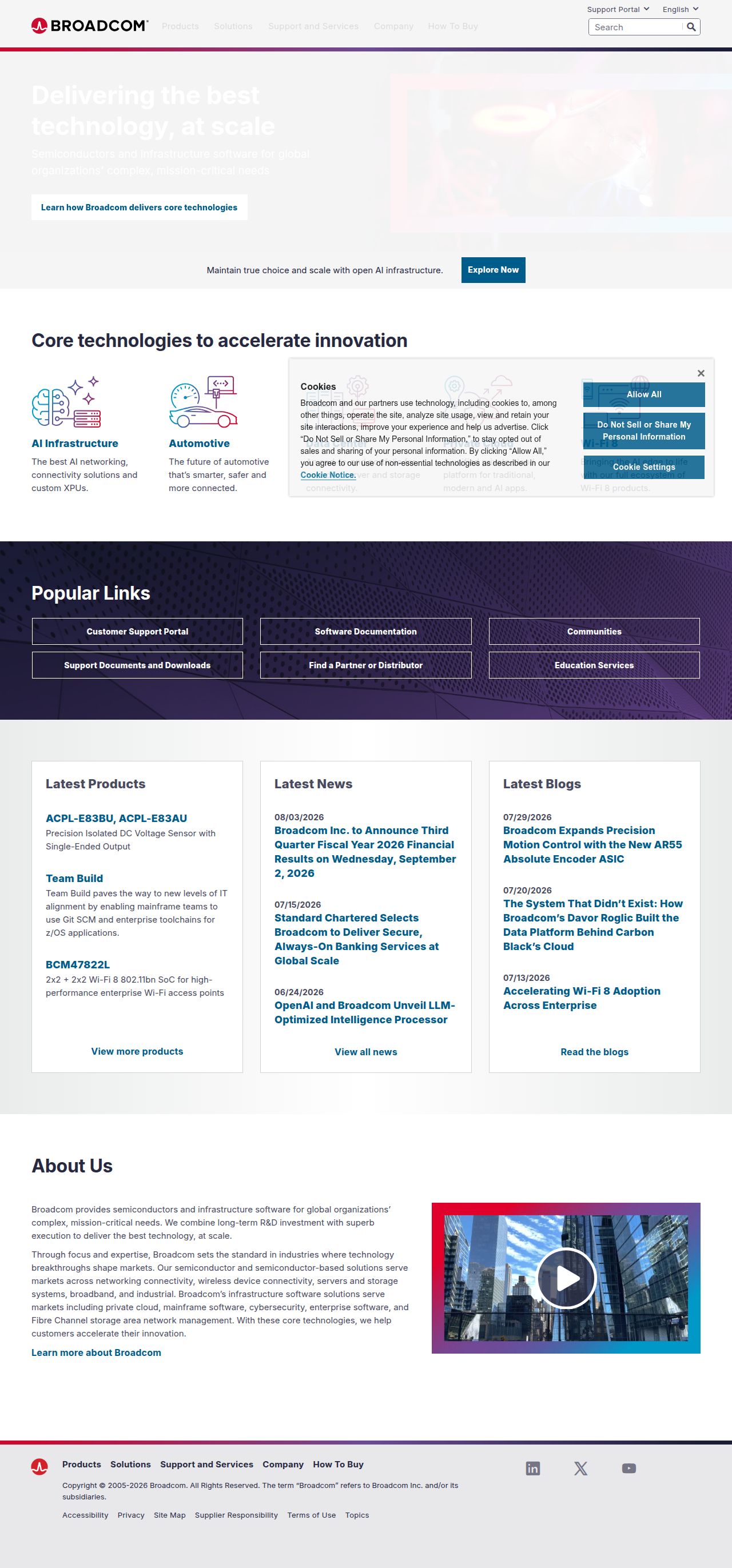
The read
The company
Positioning
Broadcom exists to power the world's modern infrastructure by connecting everything through essential semiconductor and software technology. They serve global enterprise organizations with complex, high-stakes infrastructure requirements that demand maximum reliability. Broadcom sets itself apart by providing comprehensive solutions across both hardware semiconductors and enterprise infrastructure software at global scale.
Who it is for
Global enterprise IT leaders, infrastructure engineers, system architects, and corporate technology executives.
Values
Mission-critical reliabilityGlobal enterprise scaleInfrastructure innovationInterconnectivityLook and feel
Sharp corners, balanced layout, gradients, enterprise, corporate.
Reads as
enterprisecorporatecleanstructuredtechRecurring motifs
framed video cards with play buttonsdark patterned banners with subtle line grid backgrounds- Theme
- light
- Corners
- sharp
- Density
- balanced
- Borders
- solid
- Shadows
- subtle
- Gradients
- yes
- Icons
- outlined
- Illustration
- line-art
- Photography
- full-color
- Imagery shows
- modern architecture, glass buildings, server hardware, high-tech components
- Imagery composition
- framed media player, light gradient overlays, geometric grids
- Imagery grading
- vibrant blues and cool tones
Motion
Functional, subtle interface feedback featuring quick 200ms hover transitions and steady linear animations.
Signature effects
200ms button and link hover transitionsBackground indicator shifts- Intensity
- minimal
- Speed
- fast
- Easing
- linear and short-duration state transitions
- Scroll animations
- no
- Hover effects
- yes
- Honours reduced motion
- no
Voice
The voice reads Enterprise, Authoritative, Direct, Technical.
Tone
EnterpriseAuthoritativeDirectTechnicalVoice
ProfessionalReliableCorporateSolution-orientedWords it uses
SemiconductorsInfrastructure softwareMission-criticalGlobal enterprisesConnecting EverythingWords it avoids
DisruptiveGimmickyFunCasualPlayful- Calls to action
- Direct, functional, and action-oriented enterprise callouts.
- Headline case
- title
- Hero metadata
- Bold, clear, high-level corporate assertion
- Meta description
- Direct, capability-focused enterprise positioning
The recordwhat we measured, and how sure we are
How the brand reads
Broadcom Inc. is a global technology leader that designs, develops, and supplies semiconductor and infrastructure software solutions for enterprise environments.
Known for
Semiconductor hardware solutionsEnterprise infrastructure softwareMission-critical technology systemsGlobal connectivity infrastructureDesign personality
Clean, light-mode corporate structure dominated by crisp off-whites (#F8F8F8), grounded with deep slate blues and striking red brand accents.
Design conventions
Light neutral canvas backgroundsStructured enterprise grid systemHigh-contrast dark typography and primary blue/red accentsWriting style
Concise, precise, enterprise-focused phrasing that emphasizes scale, mission-critical stability, and capability without unnecessary jargon.
Audience, inferred
Enterprise technology decision-makers, CTOs, CIOs, and system engineers managing complex digital infrastructure.
Values, inferred
Enterprise reliabilityMission-critical performanceScalabilityGlobal connectivityApplying the brand
Design slides on a clean light canvas (#F8F8F8) using deep slate blue (#2D2247, #1C1A34) for key structural elements and headings. Use vibrant red (#CC092F) sparingly for callouts, stats, or key focal points. Keep layouts highly structured, professional, and dense with content.
Spacing and accessibility
- Base unit
- 8px
- Scale
- 0.5 · 1 · 2 · 3 · 4 · 6 · 8
- Content margin
- 24px
- Contrast target
- AAA
- Minimum font size
- 16px
- Colourblind safe
- yes
How this was read
- Platform
- Generic
- Overall confidence
- 0.83
- Font confidence
- 1.00
- Schema version
- v2
The score was built from
Logo found (favicon)Primary color extractedSecondary color extractedFonts found: InterCompany name found: Broadcom Inc.Confidence is 0 to 1 — a low score is reported, never hidden. Set a floor in your own code and fall back to your defaults below it, rather than shipping the raw score as certainty.
Read something wrong? Sample it again — this page follows within 15 minutes.
Confidence per field · 19 fields
- description
- 0.00
- industry
- 0.00
- tagline
- 0.00
- accessibility.contrast_target
- 0.30
- contrast
- 0.30
- audience
- 0.85
- brand_intelligence
- 0.85
- colors
- 0.85
- copywriting
- 0.85
- font_availability
- 0.85
- fonts
- 0.85
- logo_description
- 0.85
- motion
- 0.85
- name
- 0.85
- positioning_statement
- 0.85
- tone
- 0.85
- values
- 0.85
- visual_style
- 0.85
- voice
- 0.85
Get this as JSON
GET /v1/brands/broadcom.com
curl https://api.extractbrand.dev/v1/brands/broadcom.com \
-H "Authorization: Bearer YOUR_API_KEY"Sampled from broadcom.com on . Own this brand? Claim it or report this page.