
Bank of America
Confidence is 0 to 1 — a low score is reported, never hidden. Set a floor in your own code and fall back to your defaults below it, rather than shipping the raw score as certainty.
The kit
Brand colours
Click a colour to copy its hex.
Fonts
- Headline case
- none
- Headline tracking
- normal
- Headline weight
- regular
Logo
The Bank of America logo features a stylized, woven flag mark composed of red and blue ribbon-like geometric stripes alongside bold navy typography.
Sampled from the mark
- Source
- jsonld-org
- Lightness
- 0.02
- Transparent
- yes
The page we read
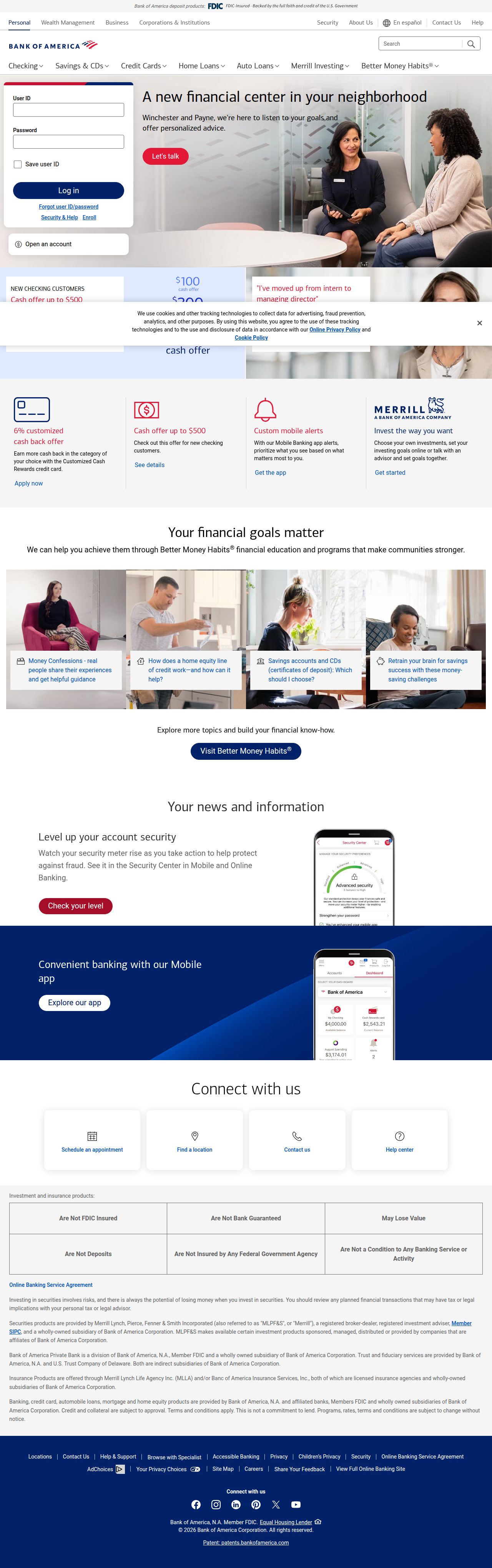
The capture every value above was read from. Its top, at readable scale.
The read
The company
Positioning
Bank of America exists to make financial lives better through the power of every connection. Serving everyday consumers, small businesses, and large institutions, they offer comprehensive banking, lending, and investment services through Merrill. They differentiate themselves through scale, security, and a purpose-driven approach focused on empowering customers to achieve their financial goals.
Who it is for
Everyday consumers, homeowners, auto buyers, small business owners, and wealth management clients seeking full-service financial solutions.
Values
EmpowermentConnectionFinancial SecurityAccessibilityLook and feel
Rounded corners, balanced layout, corporate, trustworthy.
Reads as
corporatetrustworthyaccessibletraditionalcleanRecurring motifs
white card panels on light gray backgroundsthin gray bounding grid lines in disclosures- Theme
- light
- Corners
- rounded
- Density
- balanced
- Borders
- solid
- Shadows
- subtle
- Gradients
- no
- Icons
- outlined
- Illustration
- none
- Photography
- full-color
- Imagery shows
- diverse clients and financial advisors in warm interactive consultations, everyday people at home managing finances
- Imagery composition
- medium close-ups and wide situational shots, natural lighting, subject-focused framing
- Imagery grading
- natural, warm tones with bright, balanced indoor lighting
Motion
Functional, utility-driven page loads where content panels and widget containers fade and expand smoothly into position.
Signature effects
Container height expansion on loadFade-in content reveals over 500ms to 1500ms- Intensity
- subtle
- Speed
- moderate
- Easing
- Linear and smooth cubic-bezier transitions
- Scroll animations
- no
- Hover effects
- yes
- Honours reduced motion
- no
Voice
The voice reads Trustworthy, Professional, Empowering, Clear.
Tone
TrustworthyProfessionalEmpoweringClearVoice
AuthoritativeDirectCustomer-centricReassuringWords it uses
Financial livesPower to doEvery connectionInvestingSolutionsWords it avoids
CheapGambleRiskyFast cash- Calls to action
- Direct, functional, and action-oriented navigation or goal-driven prompts.
- Headline case
- sentence
- hero headline
- Empowering and purpose-driven
- navigation
- Direct, simple, and utilitarian
The recordwhat we measured, and how sure we are
How the brand reads
Bank of America is a global financial services institution offering personal banking, credit cards, mortgages, auto loans, small business solutions, and investment management through Merrill.
Known for
Consumer bankingMerrill Lynch wealth managementCredit cardsNationwide ATMs and branchesDesign personality
Traditional, structured, and corporate light-mode layout dominated by clean off-white canvas and classic navy blue tones.
Design conventions
Strict grid structuresFunctional top-level product navigation tabsHigh-contrast call-to-action buttons in primary brand colorsWriting style
Uses simple, direct sentence-case copy focused on utility and financial empowerment, framed around customer capabilities.
Audience, inferred
Everyday consumers, homeowners, auto buyers, small business owners, and wealth management clients.
Values, inferred
EmpowermentConnectionFinancial SecurityAccessibilityApplying the brand
Use a clean light-mode layout built on off-white backgrounds (#F8F8F8) with deep navy blue (#012068) for headers and primary containers. Reserve vibrant red (#E31837) sparingly for key call-to-action buttons and primary highlights. Keep typography structured, corporate, and easy to read.
Spacing and accessibility
- Base unit
- 8px
- Scale
- 0.5 · 1 · 2 · 3 · 4 · 6 · 8
- Content margin
- 24px
- Contrast target
- AAA
- Minimum font size
- 16px
- Colourblind safe
- yes
How this was read
- Platform
- Generic
- Overall confidence
- 0.77
- Font confidence
- 1.00
- Schema version
- v2
The score was built from
Logo found (jsonld-org)Primary color extractedSecondary color extractedFonts found: cnx bold, cnx regularCompany name found: Bank of AmericaNothing could fill
font_availabilityConfidence is 0 to 1 — a low score is reported, never hidden. Set a floor in your own code and fall back to your defaults below it, rather than shipping the raw score as certainty.
Read something wrong? Sample it again — this page follows within 15 minutes.
Confidence per field · 23 fields
- description
- 0.00
- industry
- 0.00
- tagline
- 0.00
- font_availability
- 0.30
- accessibility.contrast_target
- 0.85
- audience
- 0.85
- background
- 0.85
- brand_intelligence
- 0.85
- contrast
- 0.85
- copywriting
- 0.85
- fonts
- 0.85
- logo_description
- 0.85
- motion
- 0.85
- name
- 0.85
- palette
- 0.85
- positioning_statement
- 0.85
- primary
- 0.85
- secondary
- 0.85
- text
- 0.85
- tone
- 0.85
- values
- 0.85
- visual_style
- 0.85
- voice
- 0.85
Get this as JSON
GET /v1/brands/bankofamerica.com
curl https://api.extractbrand.dev/v1/brands/bankofamerica.com \
-H "Authorization: Bearer YOUR_API_KEY"Sampled from bankofamerica.com on . Own this brand? Claim it or report this page.